Case Study
Musync Catalog
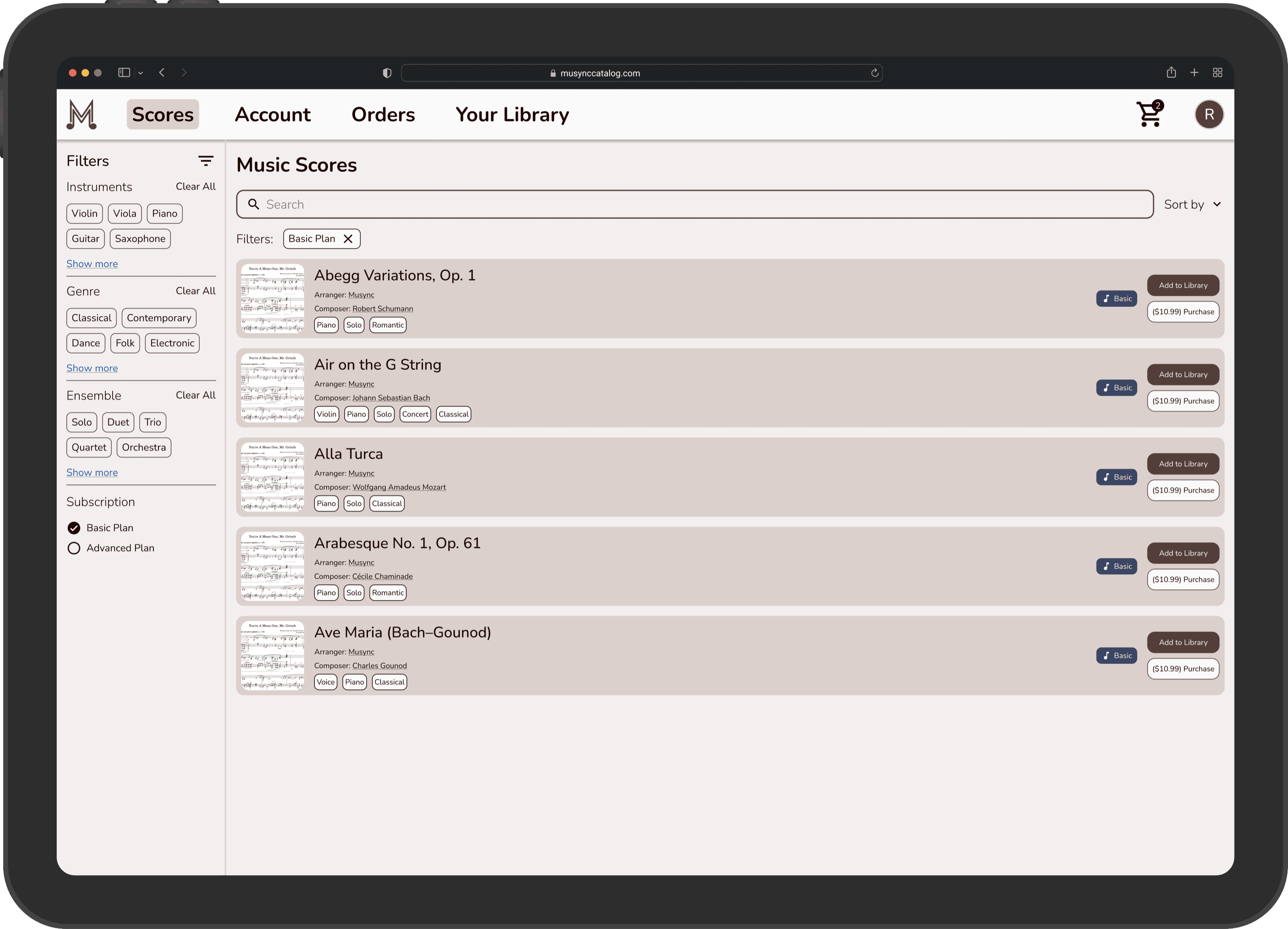
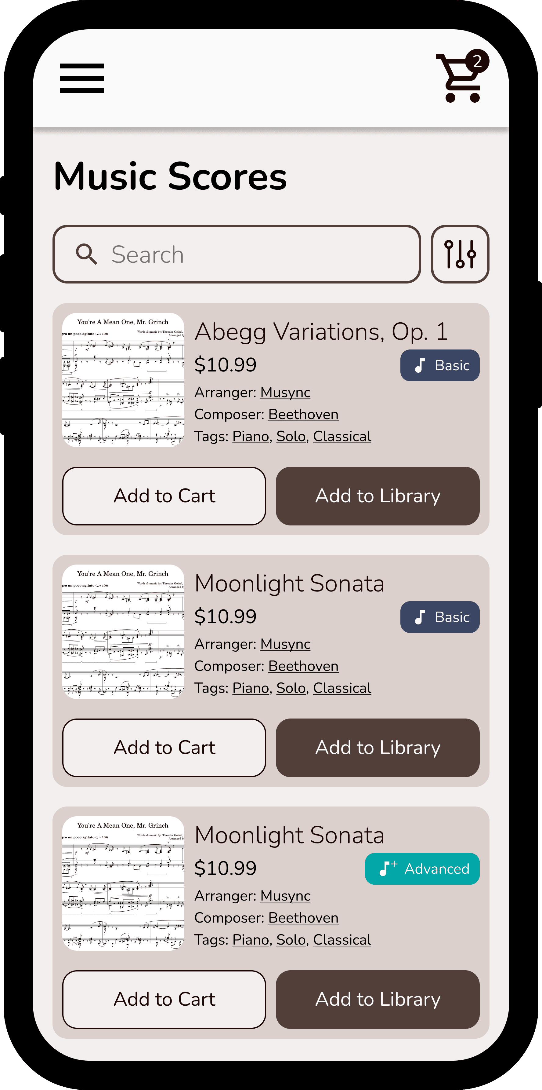
Overview
What is Musync Catalog?
Musync Catalog is a web store for anybody to purchase music scores or subscribe to add music to the Musync app.
What is the problem?
For the Musync app to make sense, there needed to be scores that musicians could readily access in order for the platform to be usable. This prompted the company to formally create a web store to facilitate this process.
What is the goal?
Have a web store for music scores to be added to the Musync app or downloaded to a user’s personal device.
Who are the target users?
The target users are simply Musync users. Musync aimed to have this platform be used by as many users from the mobile app as possible.
Role
Responsibilities
- ▪Led the UI/UX design team
- ▪Collaborated with CEO and CTO to capture vision
- ▪User research, data modeling, information architecture, prototyping, visual design system, creation of a Stripe/purchasing model, and architecting structure and backend communication with Musync Admin
- ▪Managed design-to-dev handoff and sprint planning
Research
Goal of research
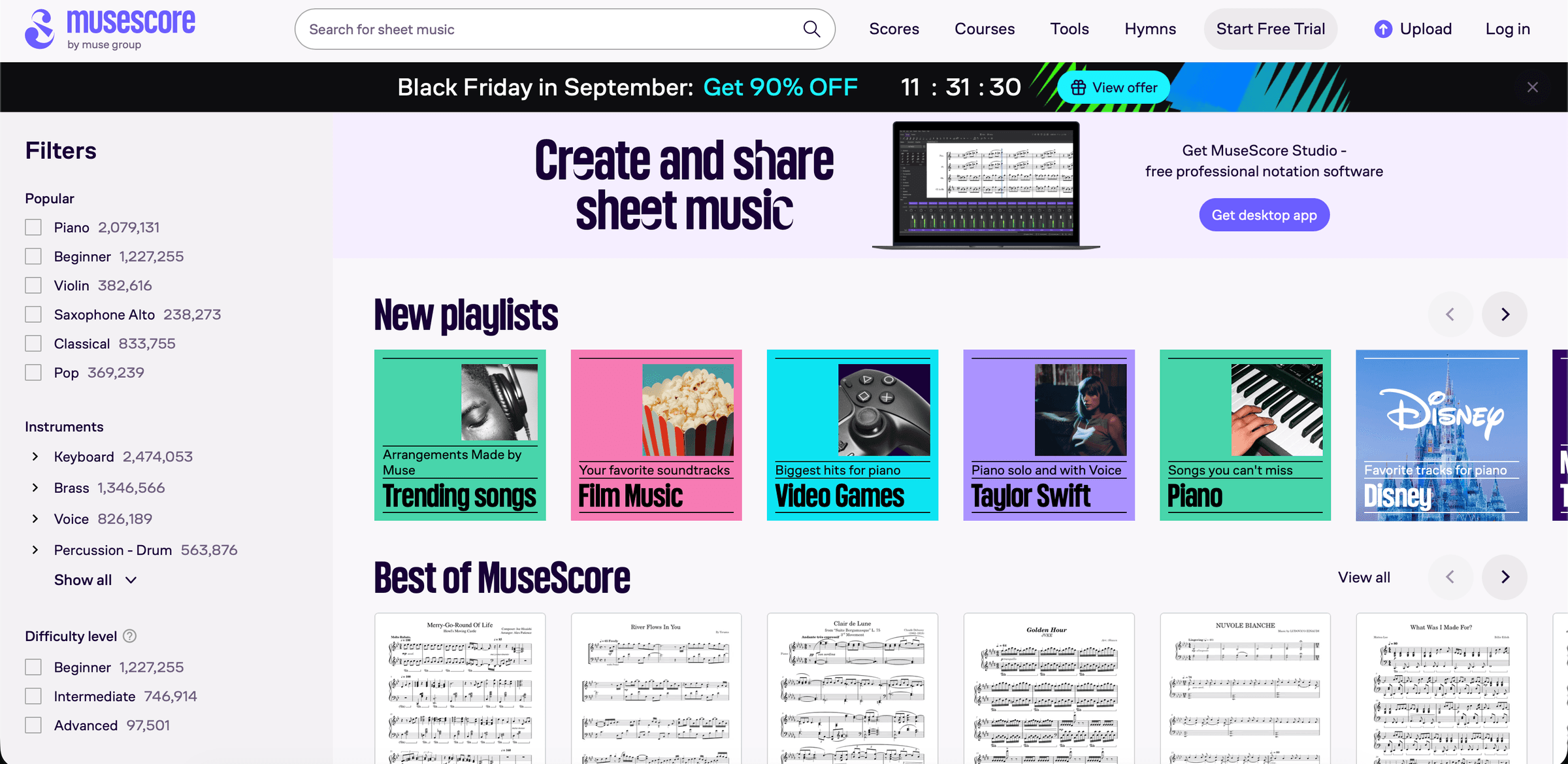
We conducted a brief audit of existing e-commerce stores and how the structure would work for our website. These included sites like MuseScore, JW Pepper, Hal Leonard, and IMSLP.
 JW Pepper
 MuseScore
 Hal Leonard
 IMSLP
IMSLP
Key findings
What we found was that the strongest candidate from our research was MuseScore, which had an immense library of sheet music and an established purchase/subscription model.
Define
Key insights
Ability to add a score from the catalog to a user’s Musync library.
Robust search and filter mechanism for quick score retrieval.
Subscription and purchase capability.
Mobile and desktop friendly experience.
Problem statement
“How might we design a mobile and desktop experience that enables any user to find, add, subscribe to, and purchase music scores?”
Ideate
Wireframing
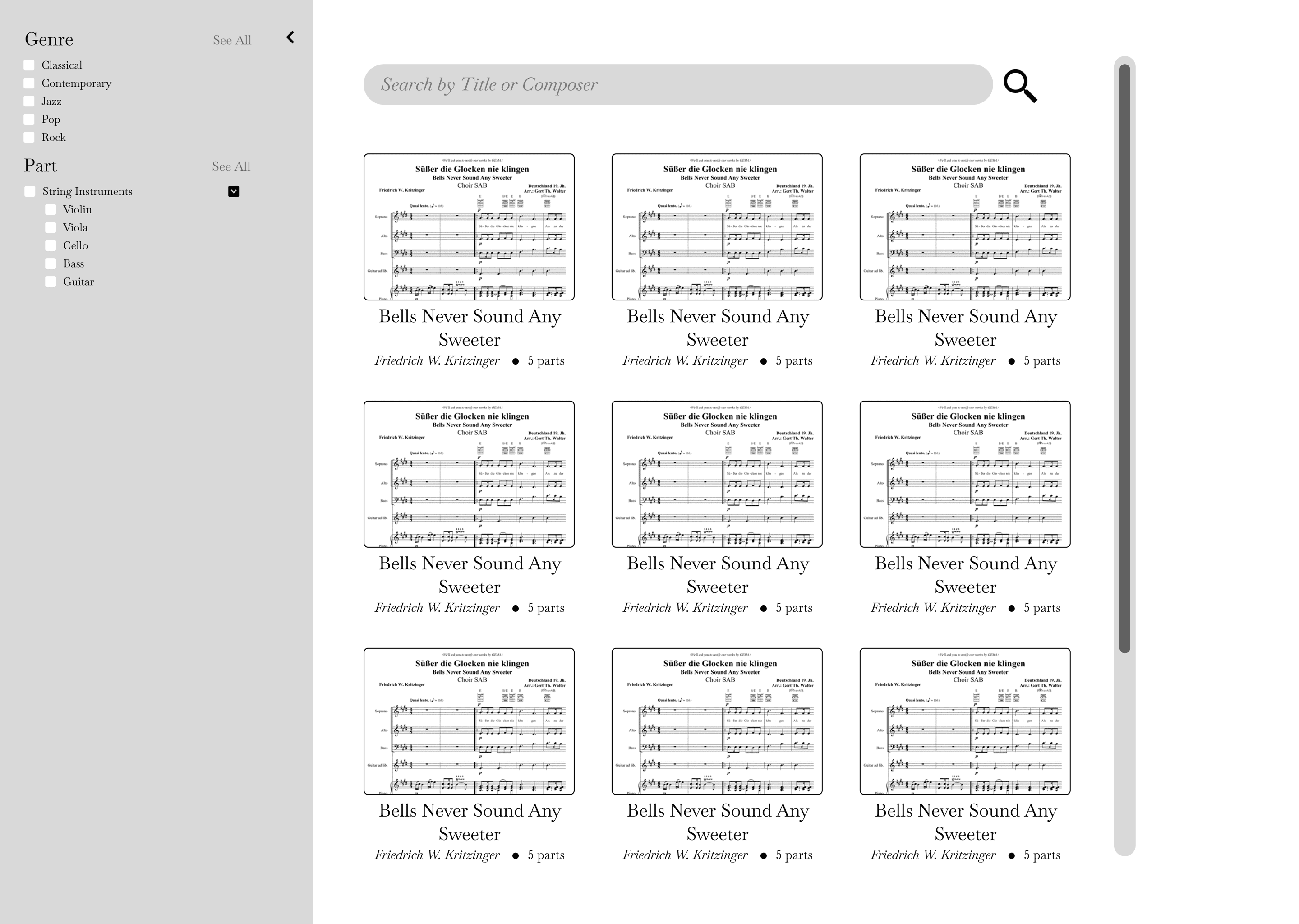
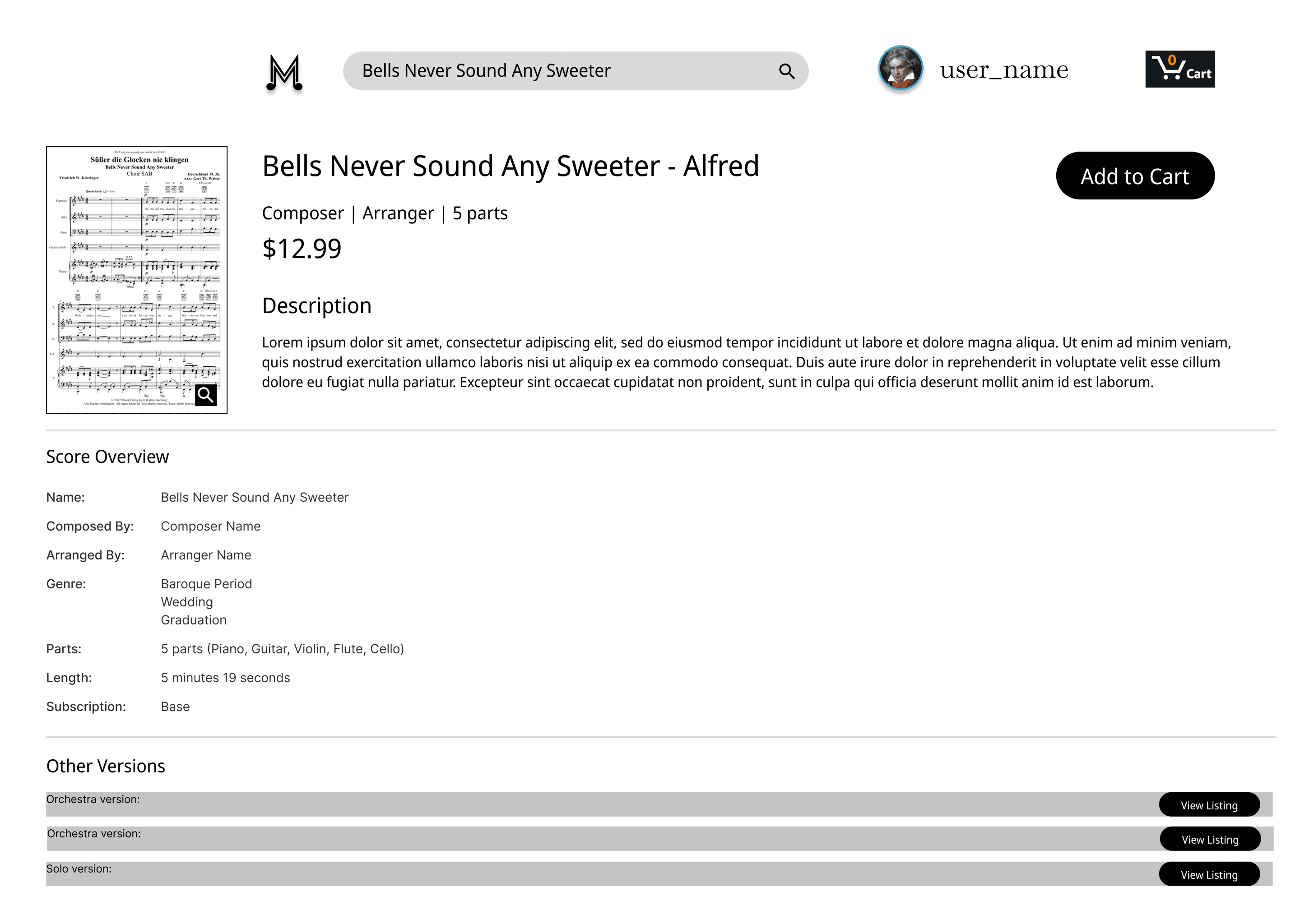
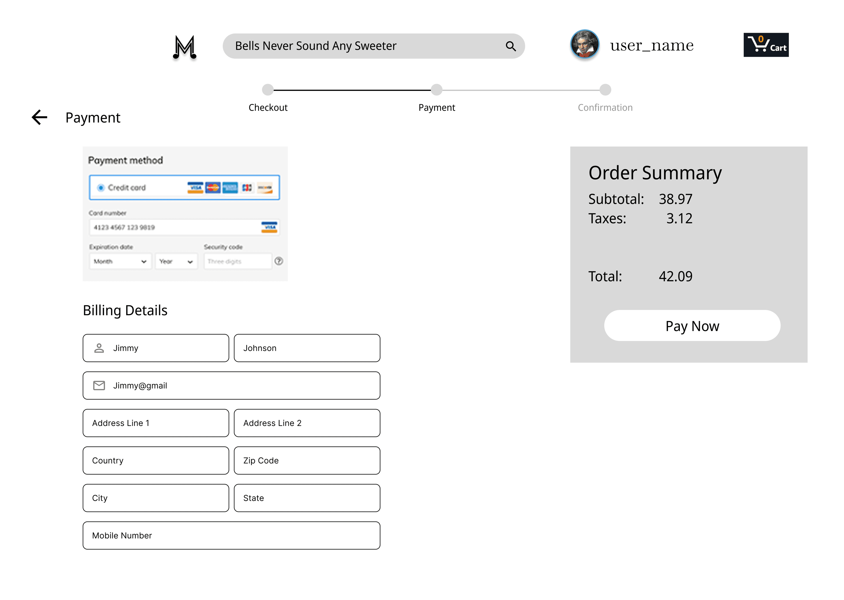
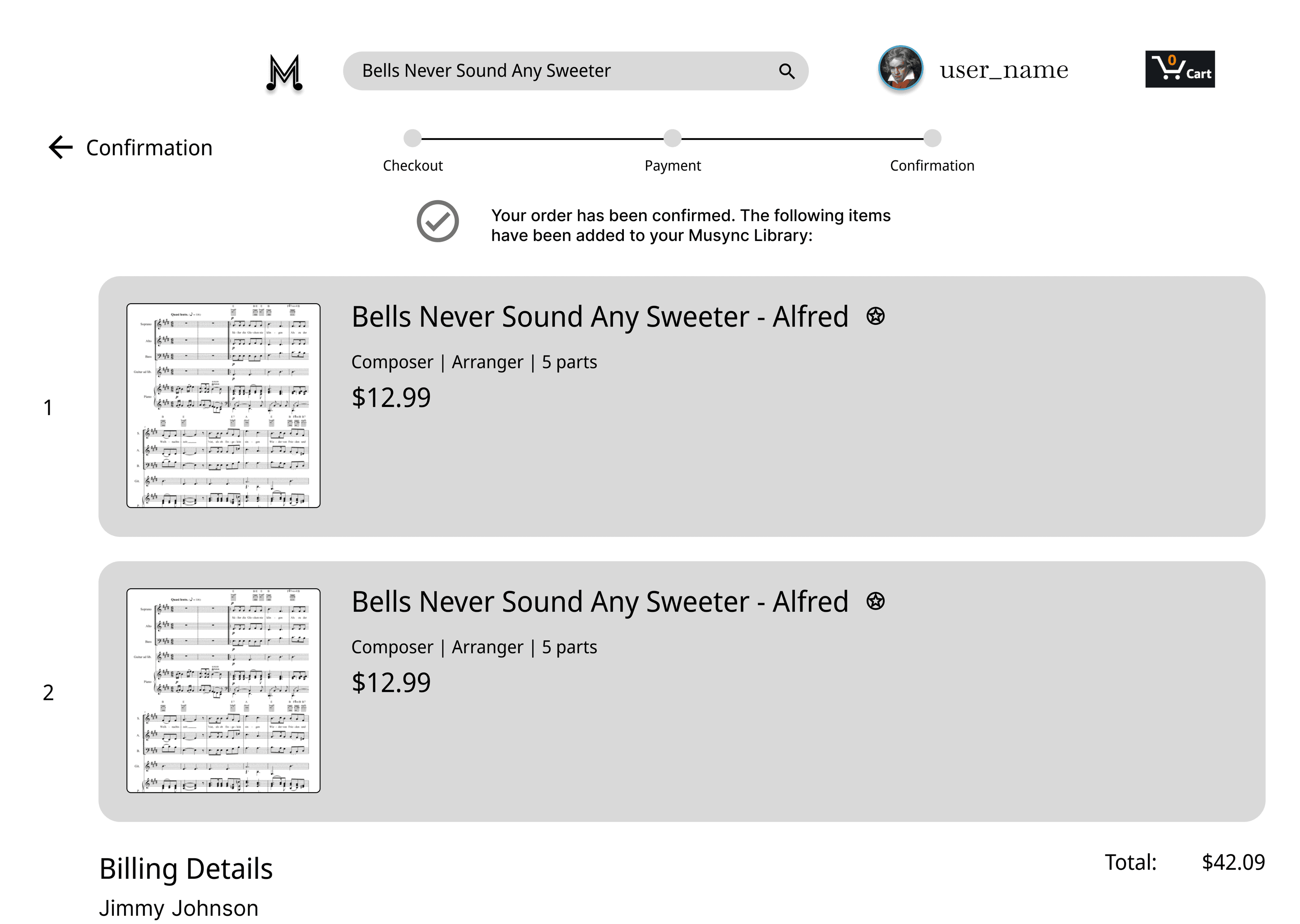
These drafts of wireframes and low-fidelity mockups were meant to lay out the organization of key components like the filter, search bar, score listing, payment screens, and confirmation of checkout. The goal was more function than design at this stage.
Information architecture
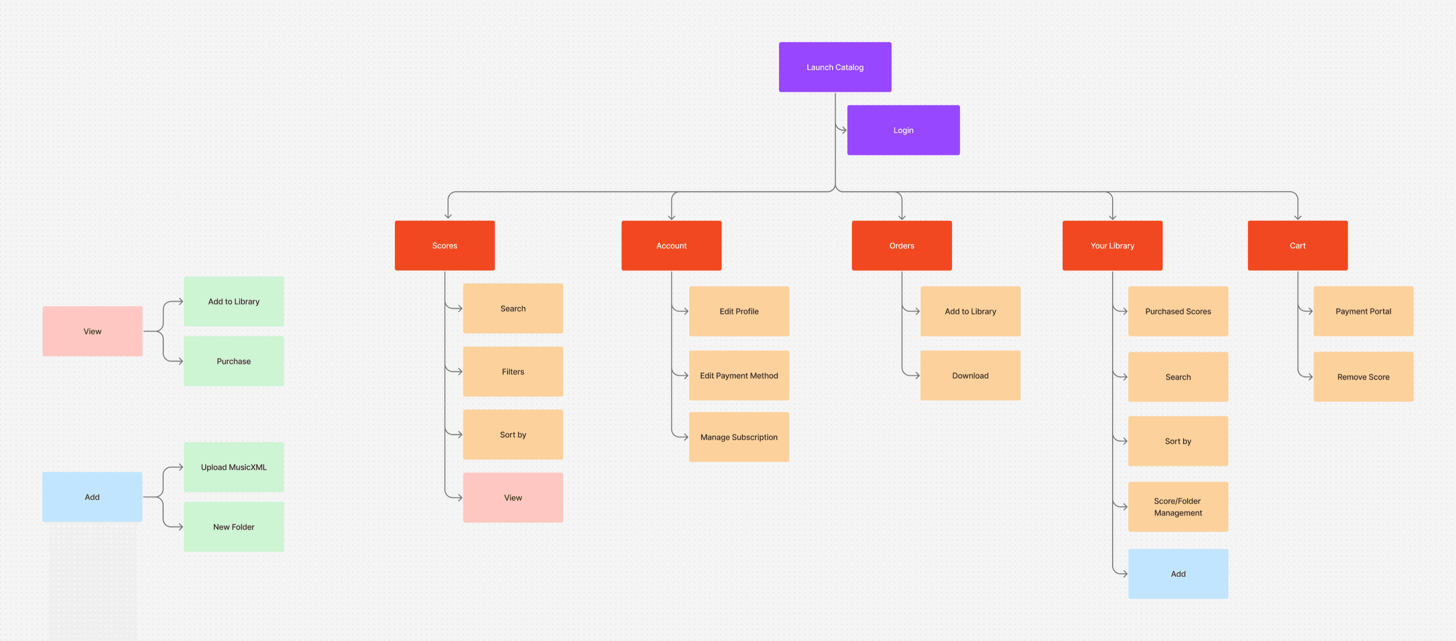
From our initial wireframing, we were able to come up with a model of important screens and sub-screens that users would interact with. We highlighted Score, Account, Orders, Your Library, and Cart to be the major functionalities of the app, with purchase/subscription being the secondary action.
Design
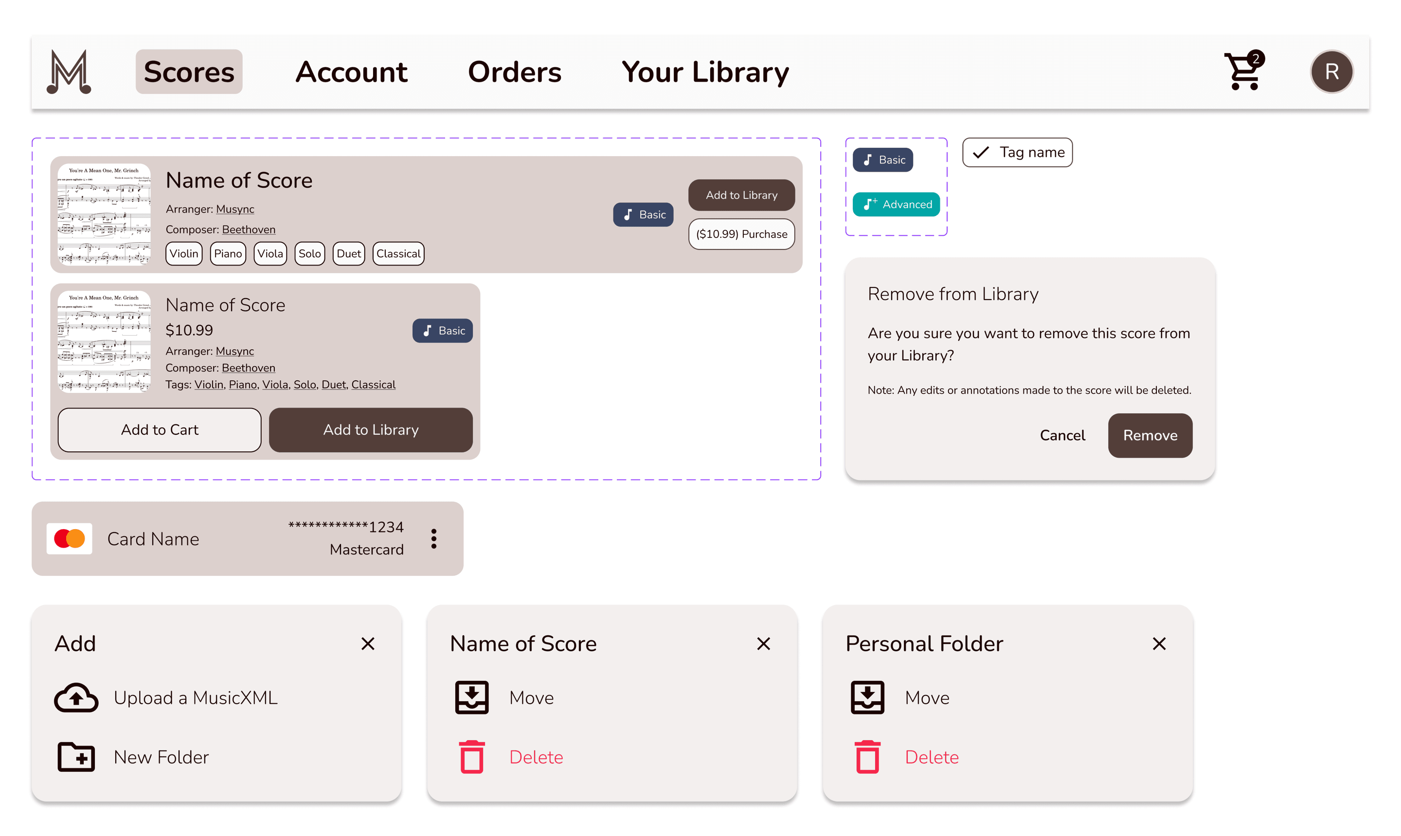
Responsive component library
Typography and color palette
As with the Musync mobile app, we wanted to keep the existing typography and color palette. As a result, we kept Nunito for the font family. This ensured consistency across platforms.
Main
Accents
Final Designs
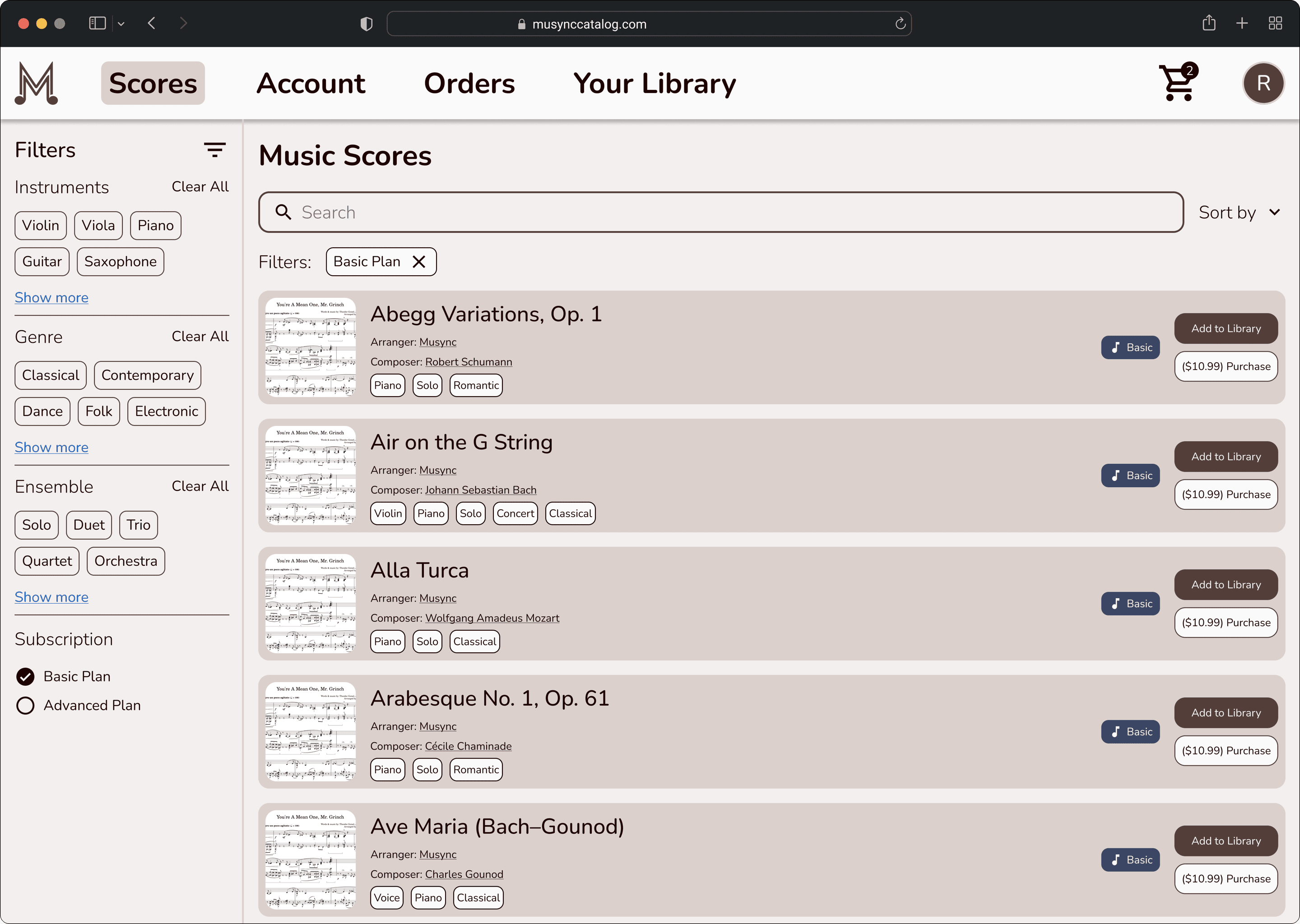
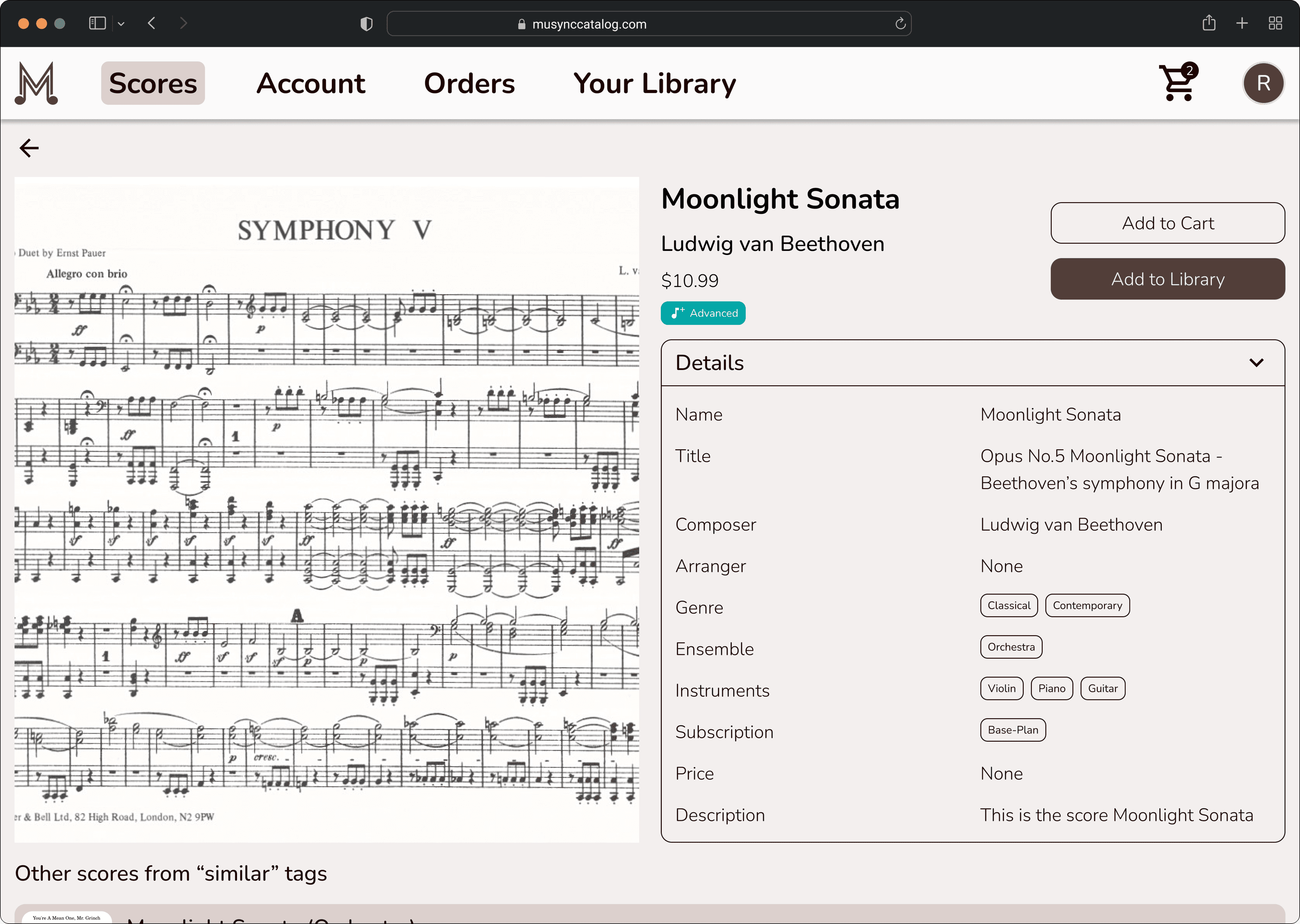
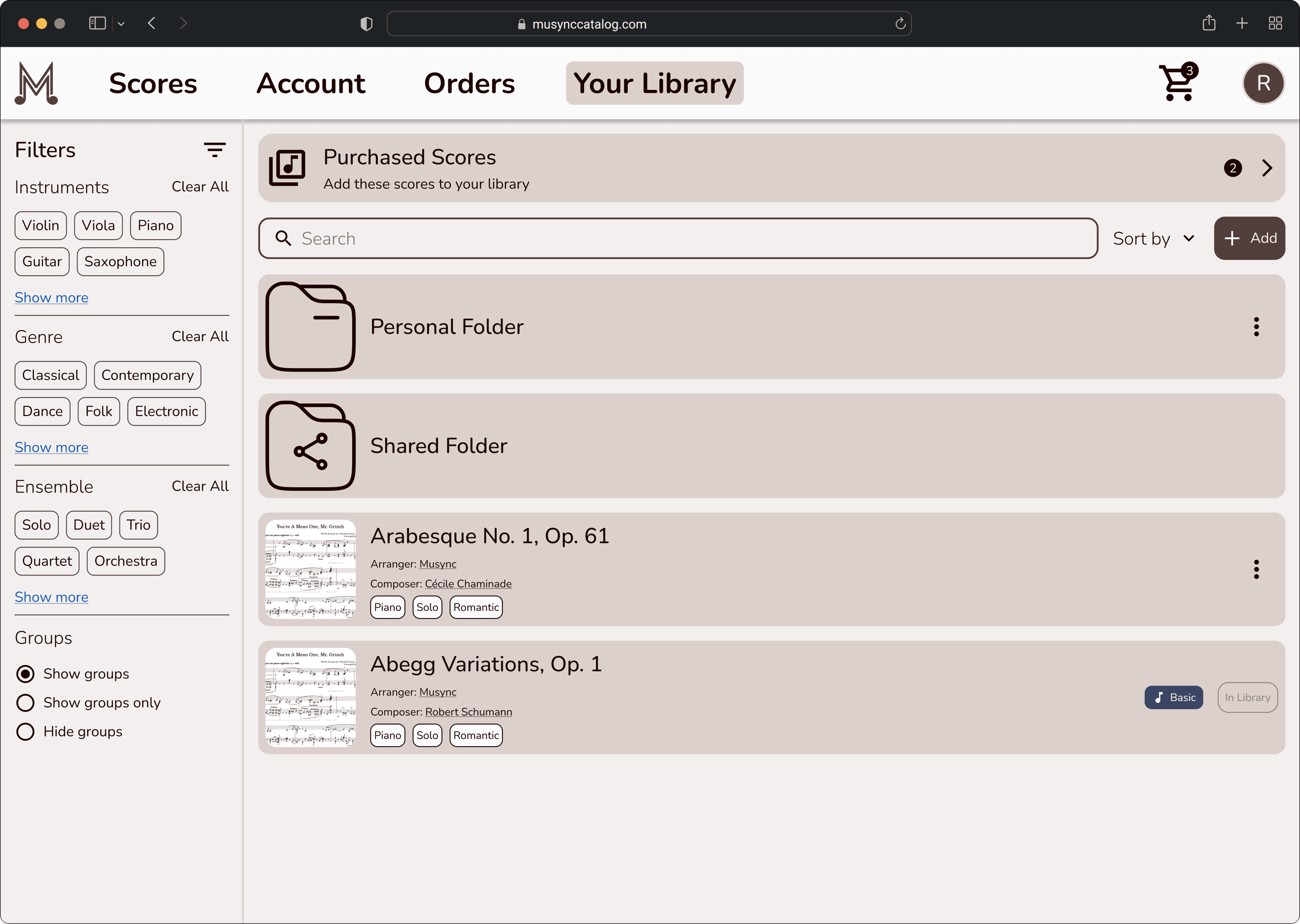
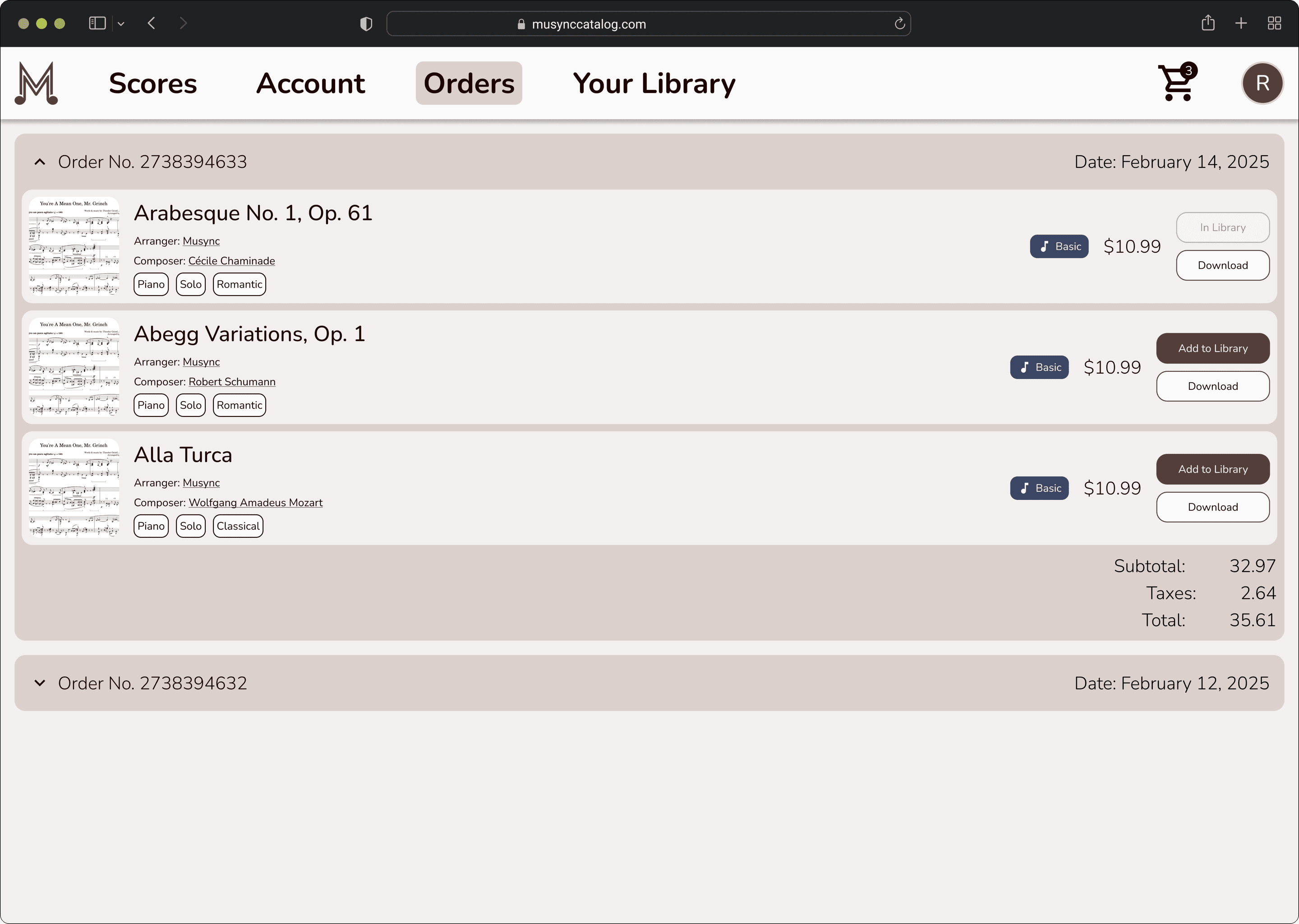
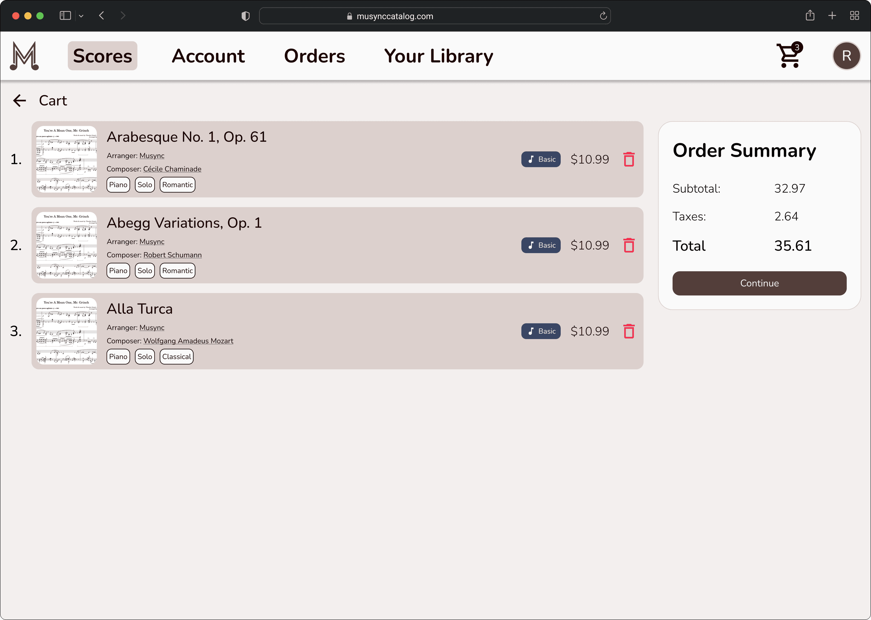
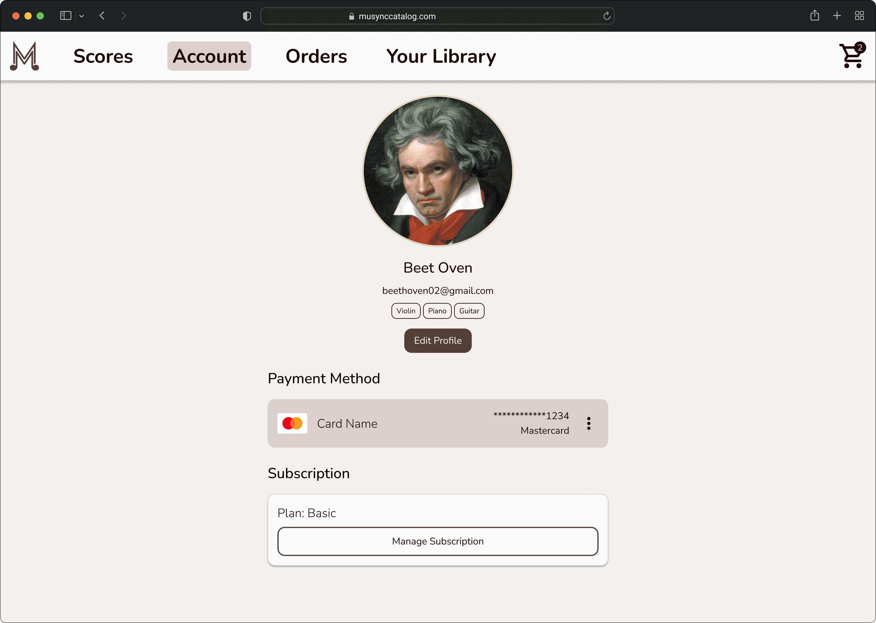
The final designs showcase the major screens with an emphasis on ease-of-use, robust navigation through search/filter/sort mechanisms, simplified purchasing portals, and cross-functionality with the Musync mobile app through the My Library section.
Reflection
This project took many iterations to become a fully-fledged platform. And as such, I believe I learned a great deal about e-commerce sites through working on the Musync Catalog. I learned about subscription and purchasing on a web store, how music scores would be visible and organized, and cross-platform communication with the mobile app.
The case study above offers but a glimpse of all the hours my team and I put in to make this project come to fruition. As in the mobile app, I’m incredibly grateful for Musync, especially to Ismail Husain and Javed Husain, for giving me the opportunity to put on so many different hats and grow as a working professional.
Thank you so much for reading this case study and taking the time to go through my work.