Case Study
Musync App
Overview
What is Musync?
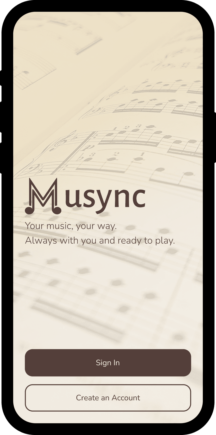
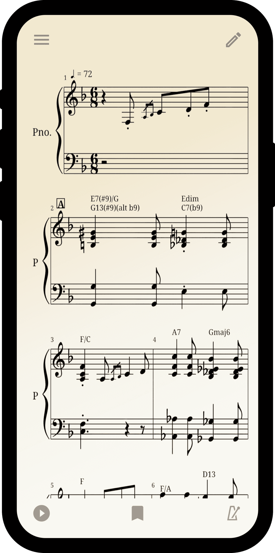
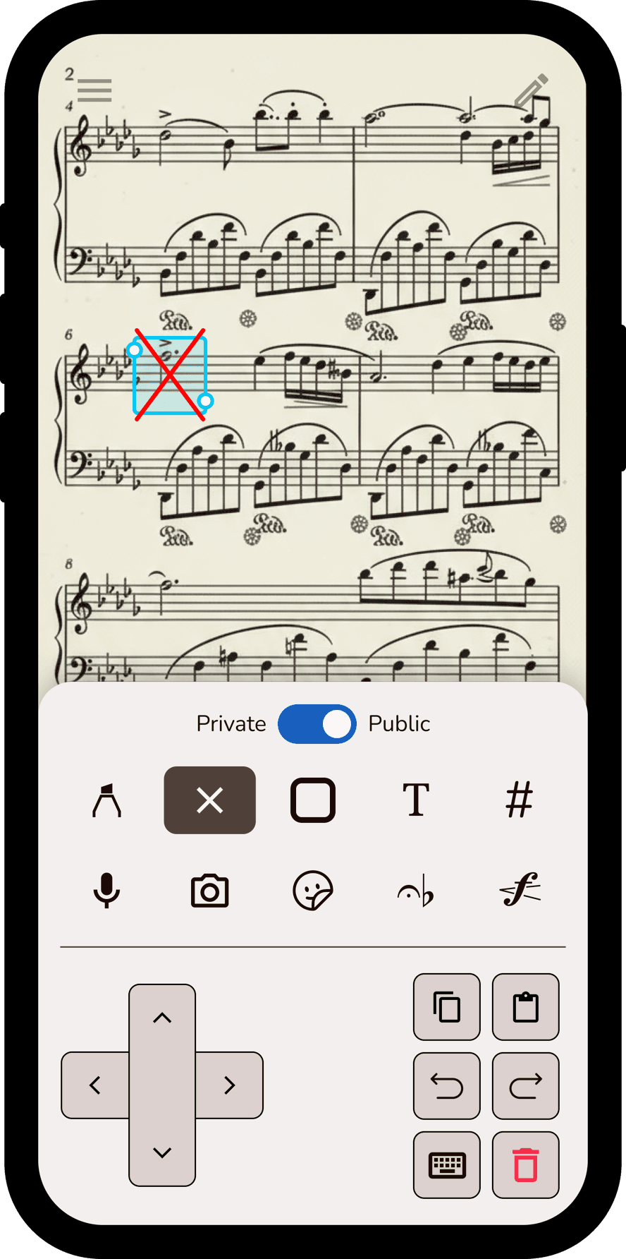
Musync is a collaboration tool that enables musicians to organize, annotate, and edit their music digitally.
What is the problem?
No adequate platform delivers the ability for musicians to collaborate on sheet music and annotate music digitally.
What is the goal?
Update the current practices of using paper and pencil for sheet music related functionalities to a fully organized digital platform — take what was once a paper-based practice to a fully digital one.
Who are the target users?
Intermediate to advanced musicians (specifically targeting college students) and music educators like band and orchestra directors.
Role
Responsibilities
- ▪Led the UI/UX design team
- ▪Collaborated with CEO and CTO to capture vision
- ▪User research, data modeling, information architecture, wireframing, prototyping, and visual design system
- ▪Managed design-to-dev handoff and sprint planning
- ▪Fulfilled the certification of the app on the App Store and Play Store
Research
Goal of research
Understand musician pain points when playing music in small to large ensembles and what digital tools would push musicians over the edge to use an app for consumption of music from using paper-based methods.
Competitive audit
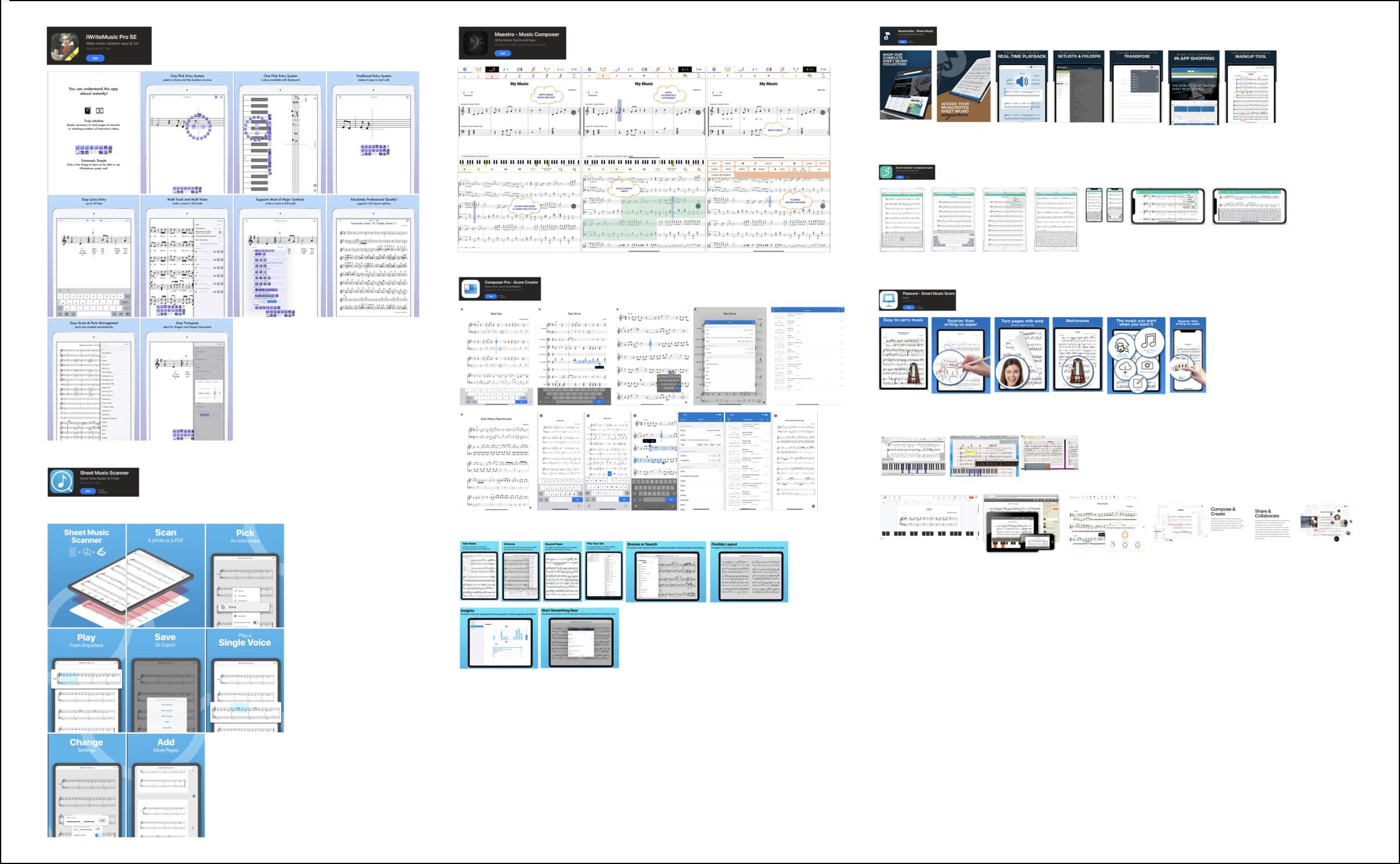
Conducted competitive audits of other apps like Sibelius, Flat.io, MuseScore, Tomplay, and other well-known digital sheet music tools.
 Sibelius
 Flat.io
 MuseScore
 Tomplay
Findings
Annotation capabilities are clunky or nonexistent in many platforms.
Composition and editing can vary from highly complex to not present.
Group collaboration and Google-Docs-type syncing are not present in most platforms.
User interviews & pain points
We conducted user interviews with:
How easy is the platform to use and what parts are useful for the musician.
Importance of an annotation capability that can “sync” with other musicians in a group.
Digital vs. paper — a clear defining line.
Musicians need to be able to have tablet functionality.
Define
Key insights
Easy to use navigation and group collaboration.
A digital annotation keyboard that allows for “group syncing.”
Experience must enhance the older paper-based format.
Tailored for mobile and tablet viewing experiences.
Problem statement
“How might we design a mobile and tablet experience that enables musicians to collaborate and annotate their music efficiently and make the transition from paper to digital as seamless as possible?”
Ideate
User flows
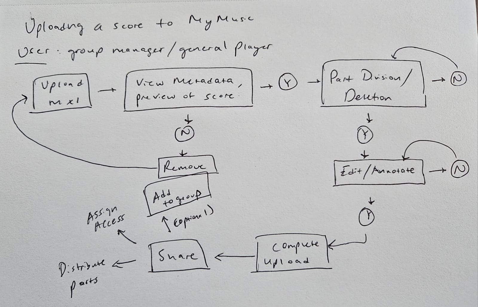
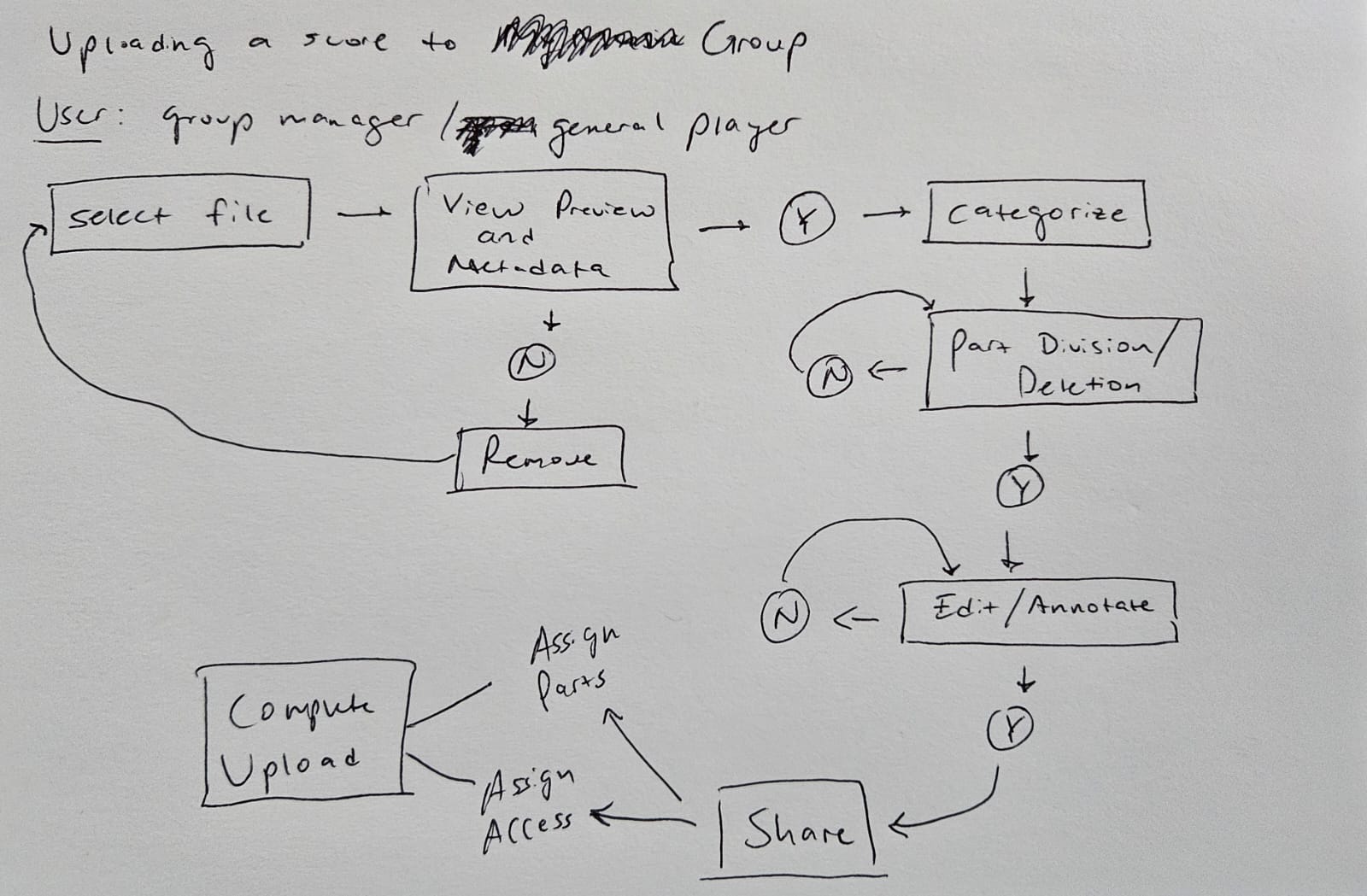
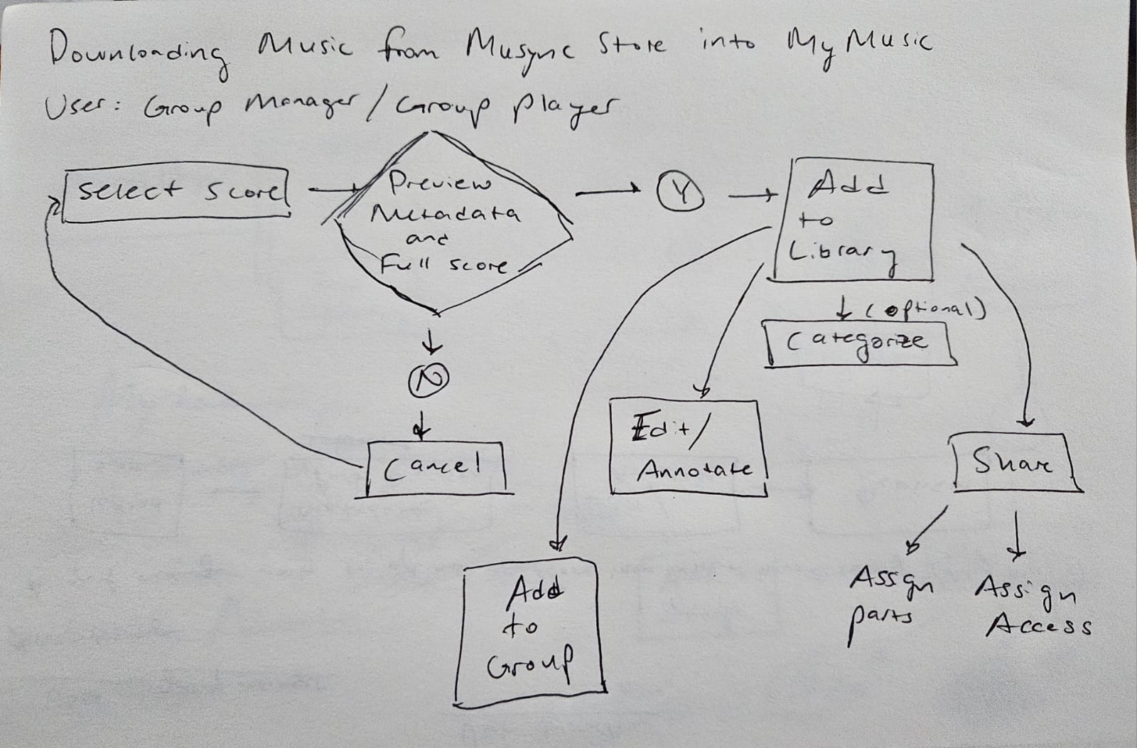
A vital component of ideation was coming up with user flows for use cases we knew would be structurally complex and require multiple moving parts. We sketched flows for uploading a music file to your Library, uploading a file to a group, and downloading a music file from the catalog.
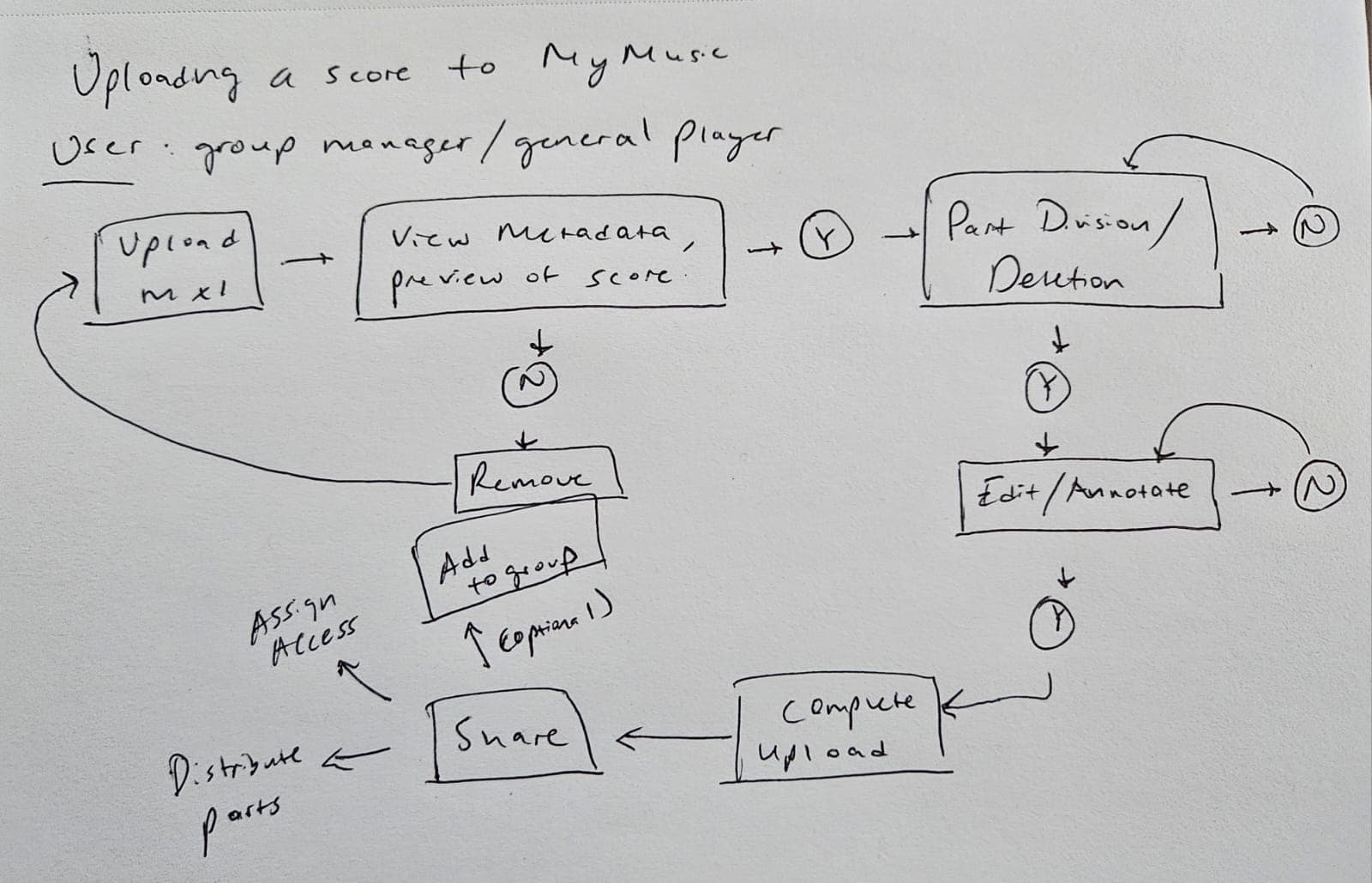 (opens full size in a new tab)
Uploading a score to My Music 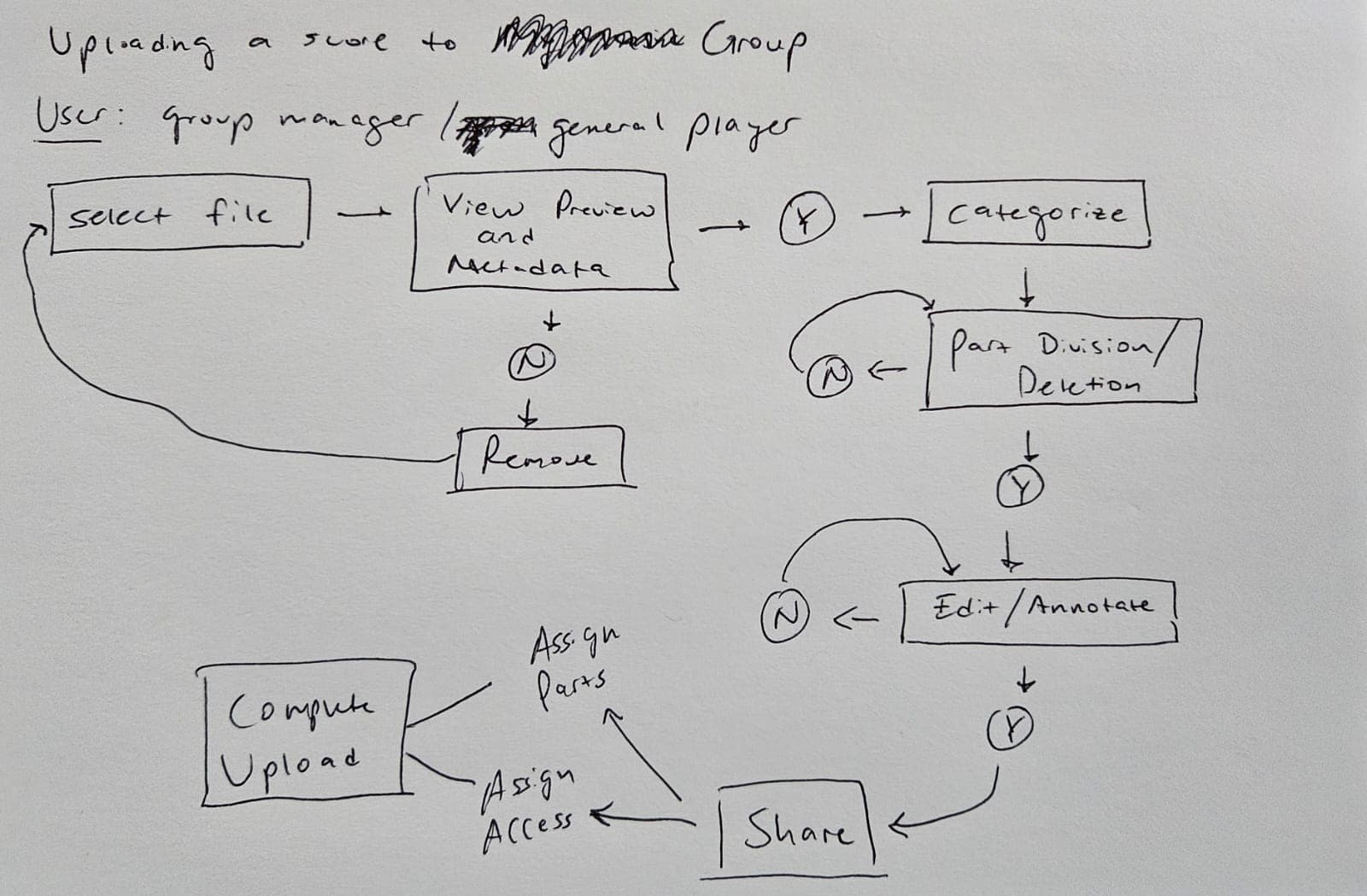 (opens full size in a new tab)
Uploading a score to a group 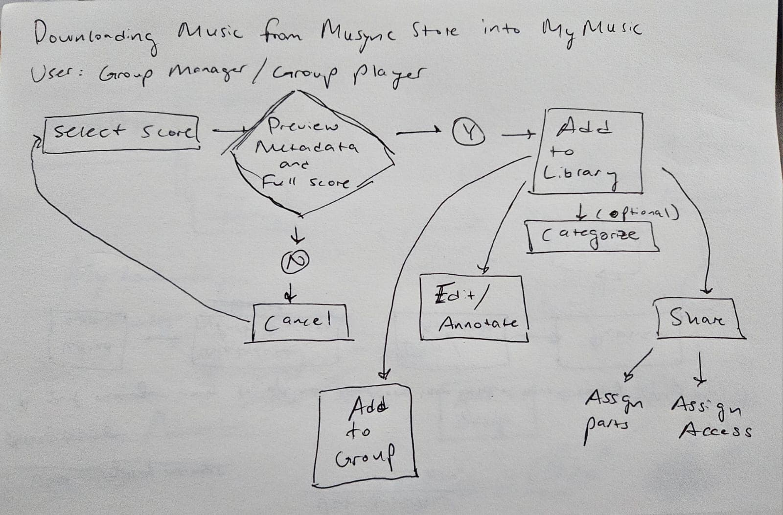 (opens full size in a new tab)
Downloading music from the Musync Store 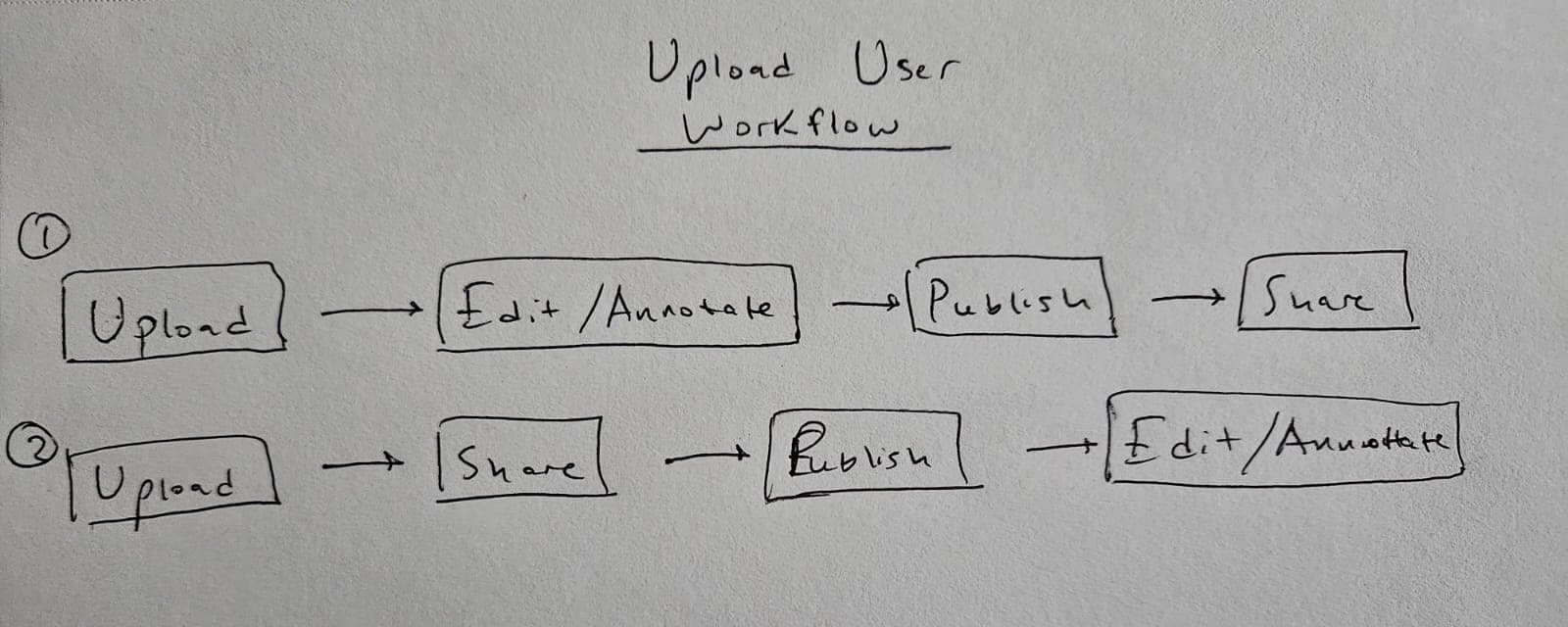 (opens full size in a new tab)
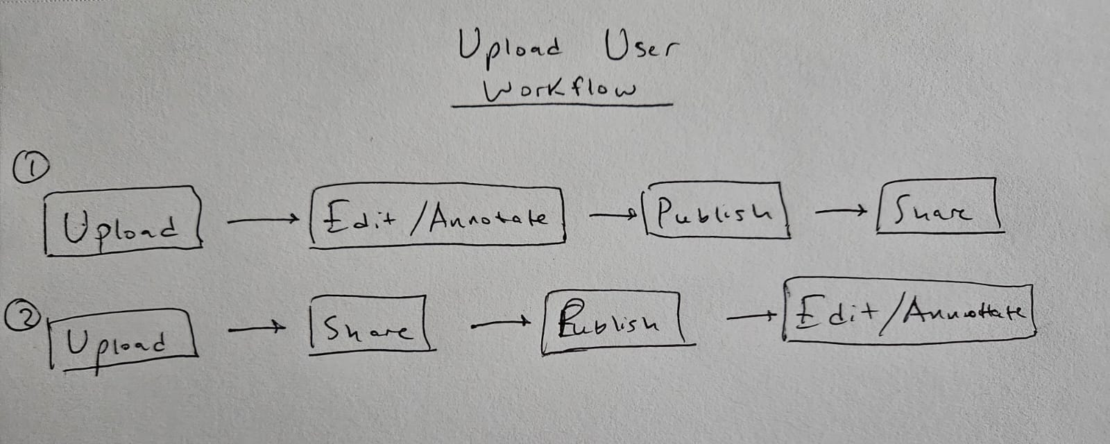
Upload user workflow — two orderings
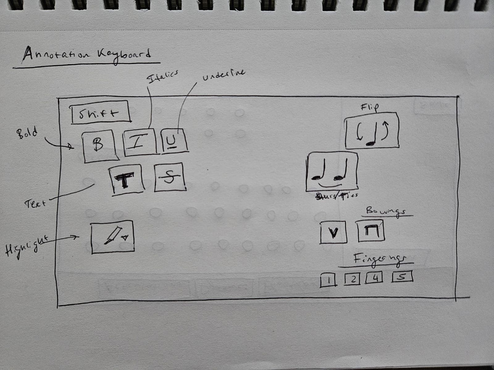
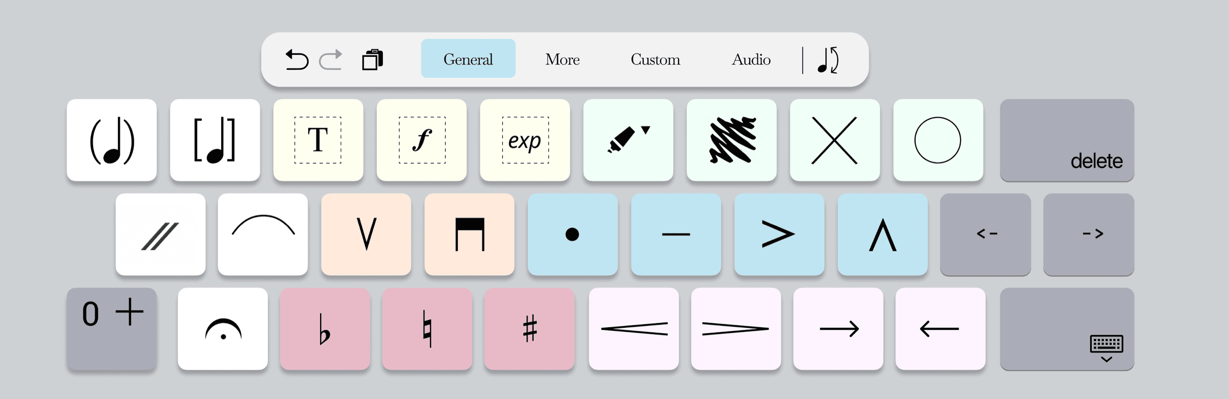
Annotation keyboard
Annotation is a central component of the music experience. So that the paper-to-digital transition could be as seamless as possible, we formalized an annotation keyboard that provides the major functionalities musicians need, in the style of an iOS or Android text keyboard.
We drafted several keys onto an iPad keyboard and color coded it to the categories of annotations musicians have at their disposal.
 (opens full size in a new tab)
Formatting and notation keys 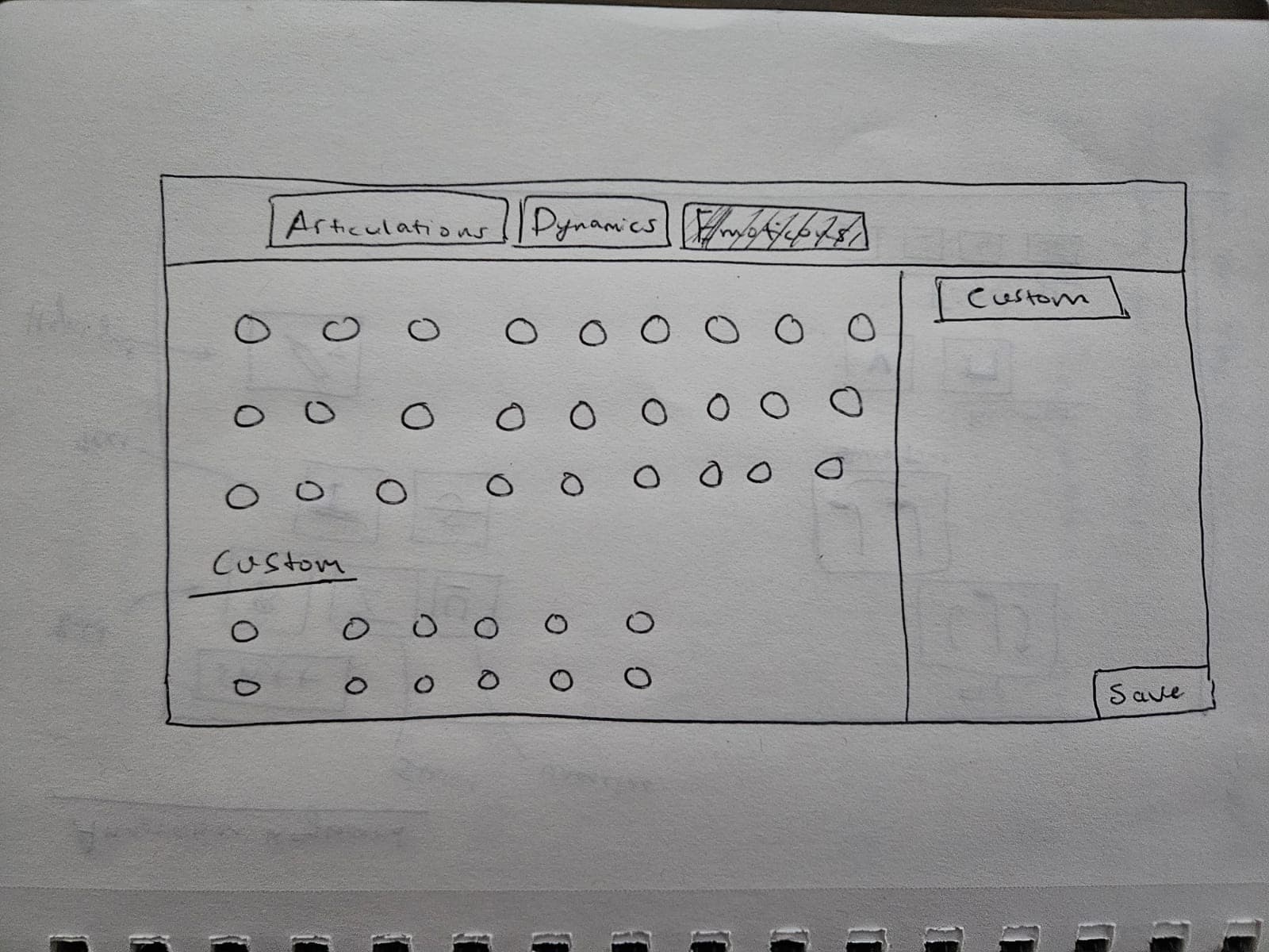 (opens full size in a new tab)
Tabbed layout with custom keys
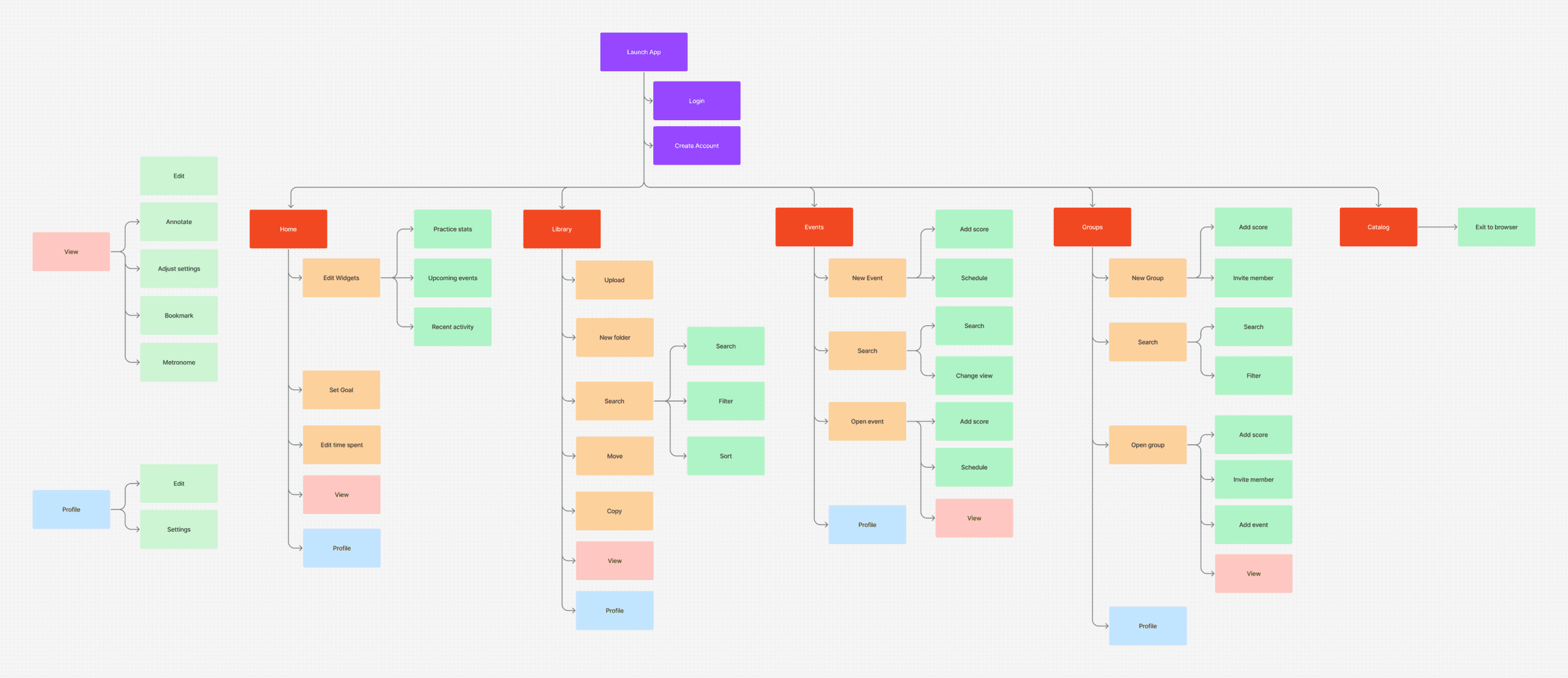
Information architecture
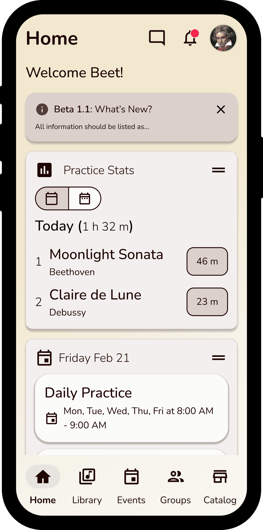
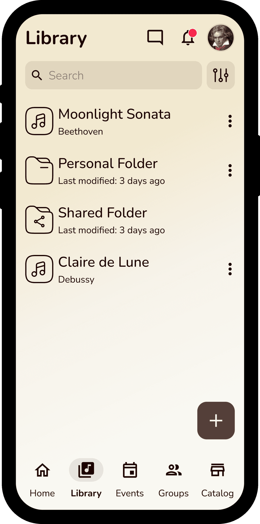
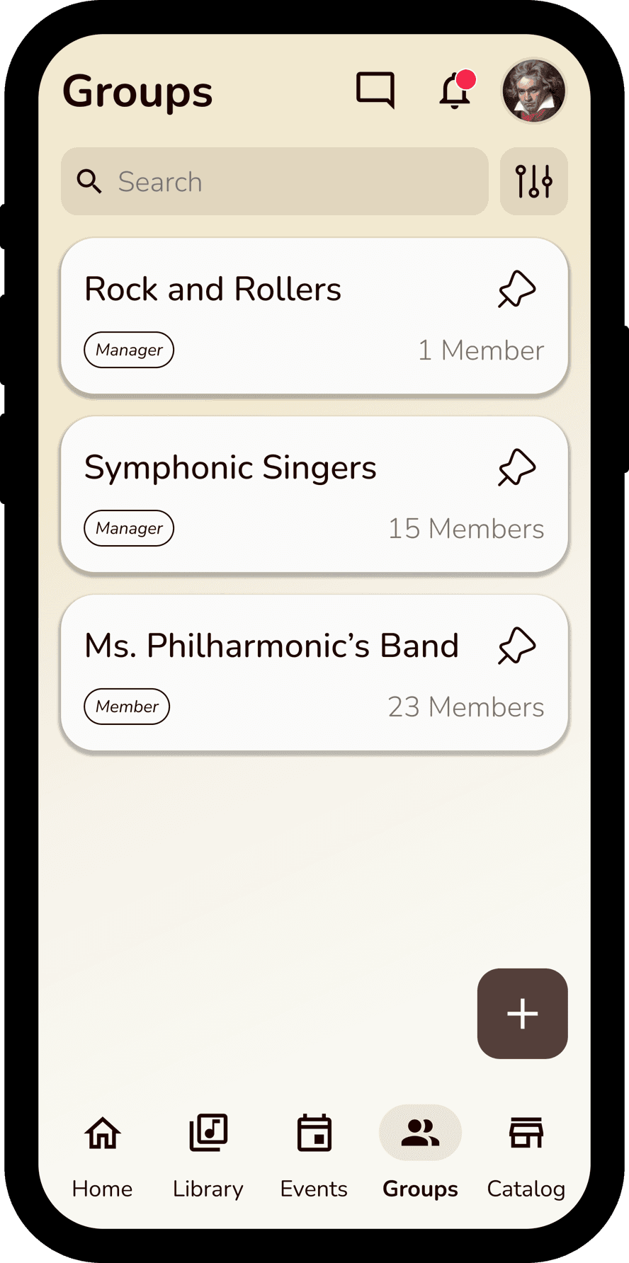
For the complex nature of this app to work cohesively, we modeled out the information architecture, highlighting Home, Library, Events, Groups, and Catalog as major screens/interactions and viewing a score as the primary action.
Design
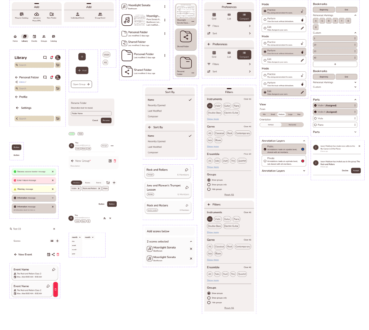
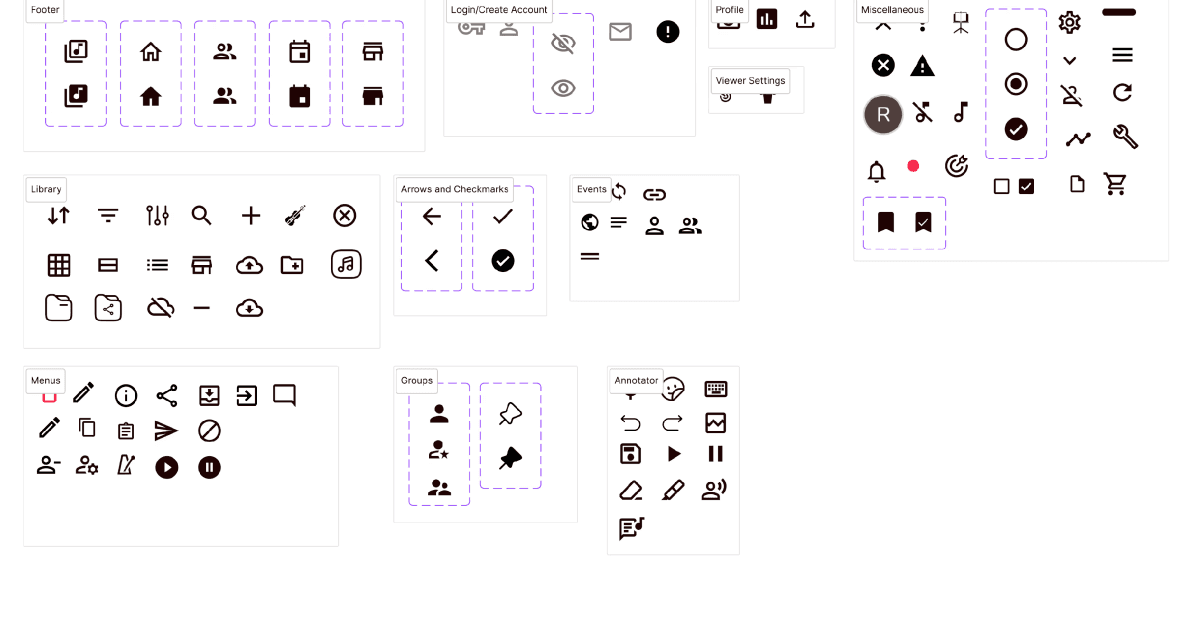
Responsive component library
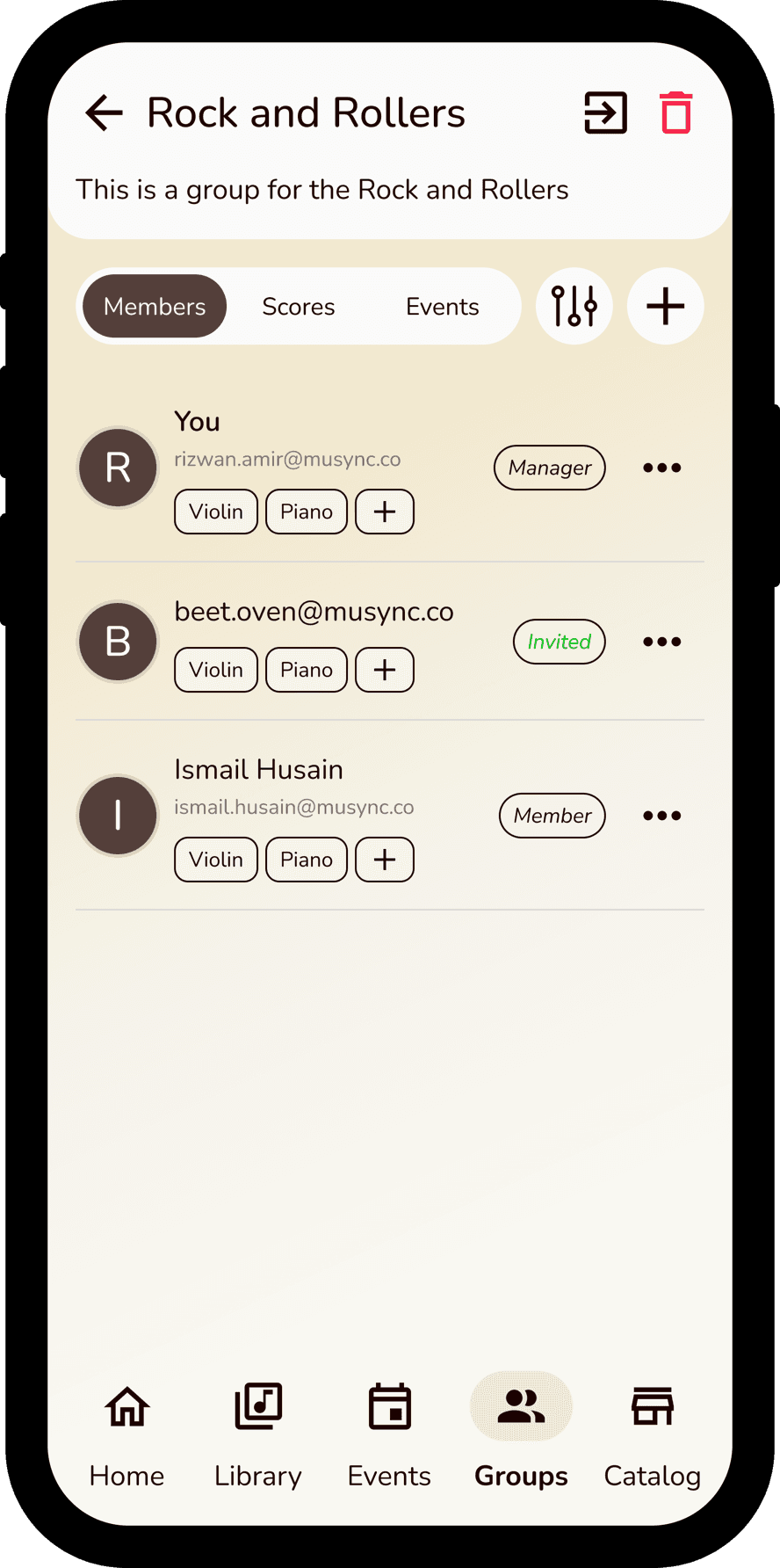
Every component — library views, filters, group management, event scheduling — was built into a responsive component library so the product stayed consistent as it scaled.
Typography & color palette
From the vision of the CTO of wanting a sophisticated but friendly atmosphere in the app, Nunito was the best font to accomplish this.
The color palette was generated from the vision of the CTO, who wanted an earthy palette that incorporates the antique quality of sheet music, with a golden/yellow color. As a result, we came up with a brown-beige color palette to accompany this primary motif.
Main
Accents
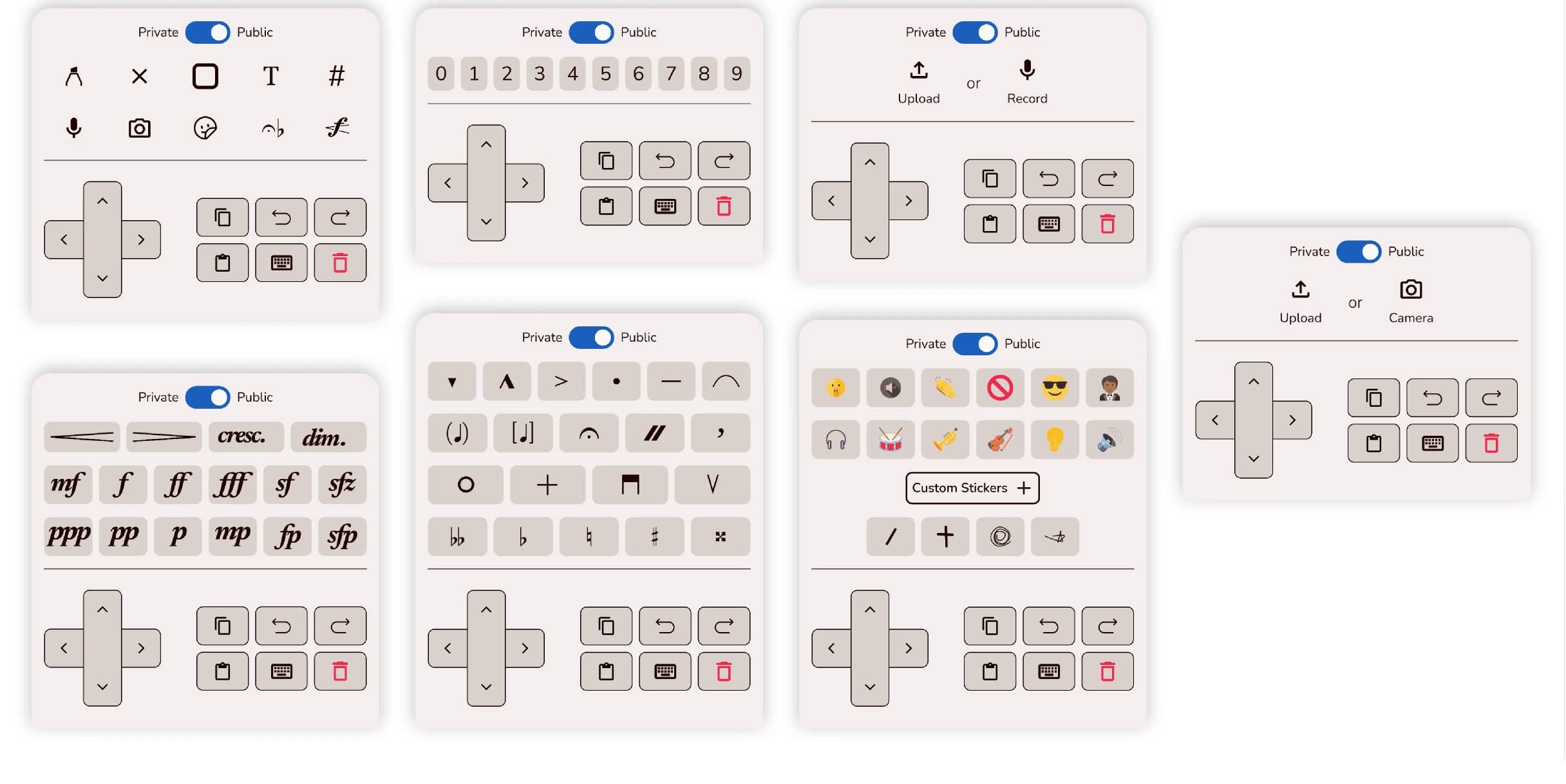
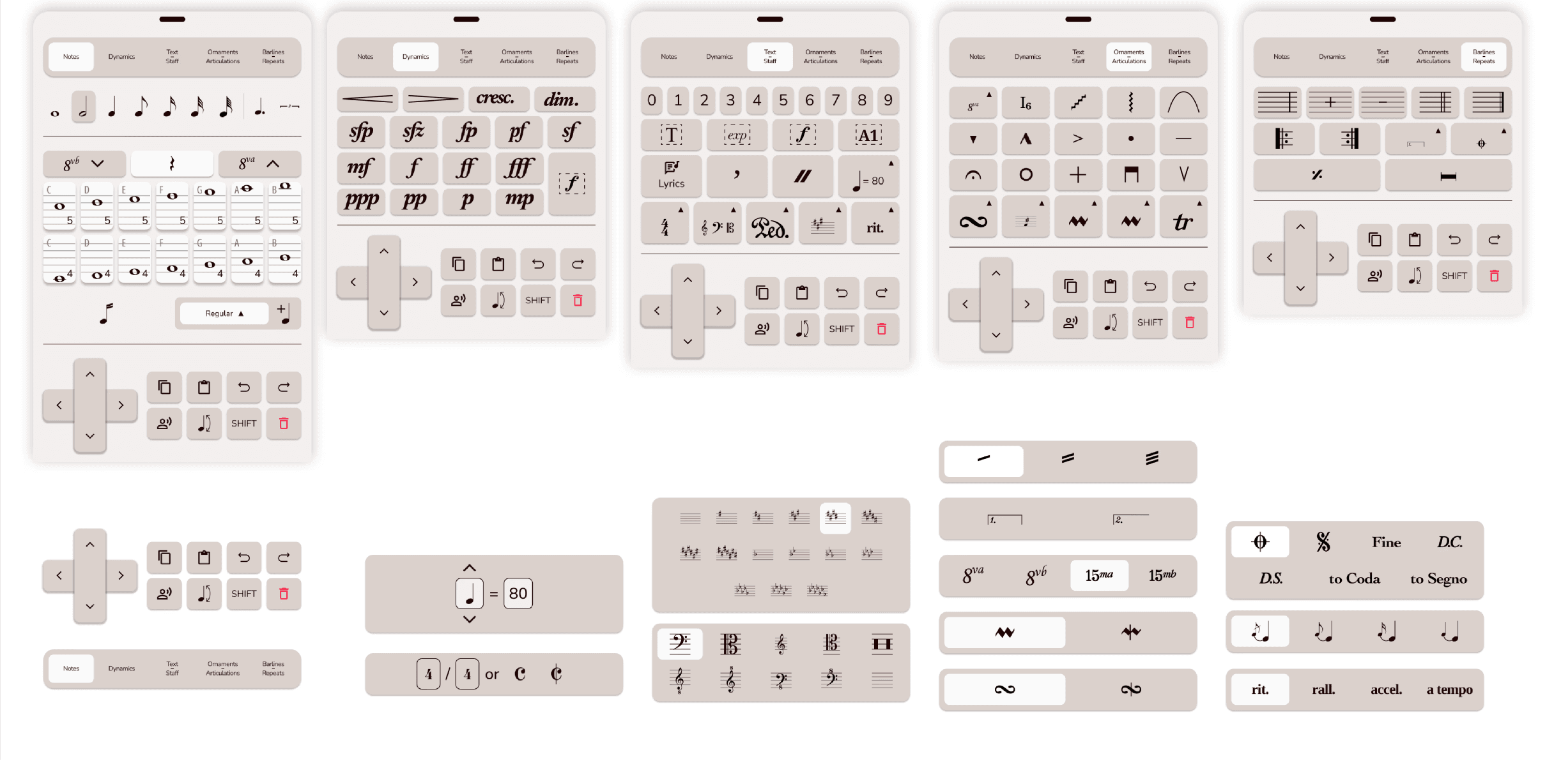
Annotation & editing keyboards
Annotation was central to the creation of this app, so the keyboard needed to be easily navigable and efficient. The CTO’s vision for navigation was to emulate a video game D-pad, and we pushed further with custom emoji stickers, images, audio, and multi-note annotations.
Since the app would be used in group and lesson-based settings, we also designed a matching editing keyboard so users could fully edit music to their wishes, modeled after the annotation keyboard with full-scale compact functionality.
Test
Iterative refinement
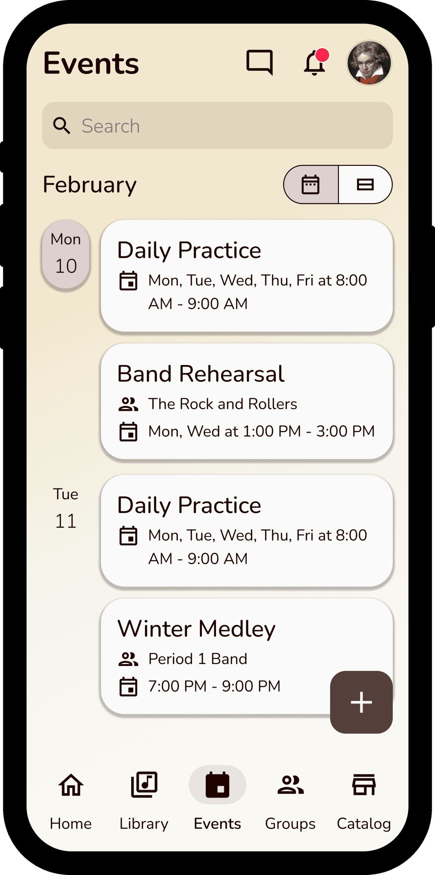
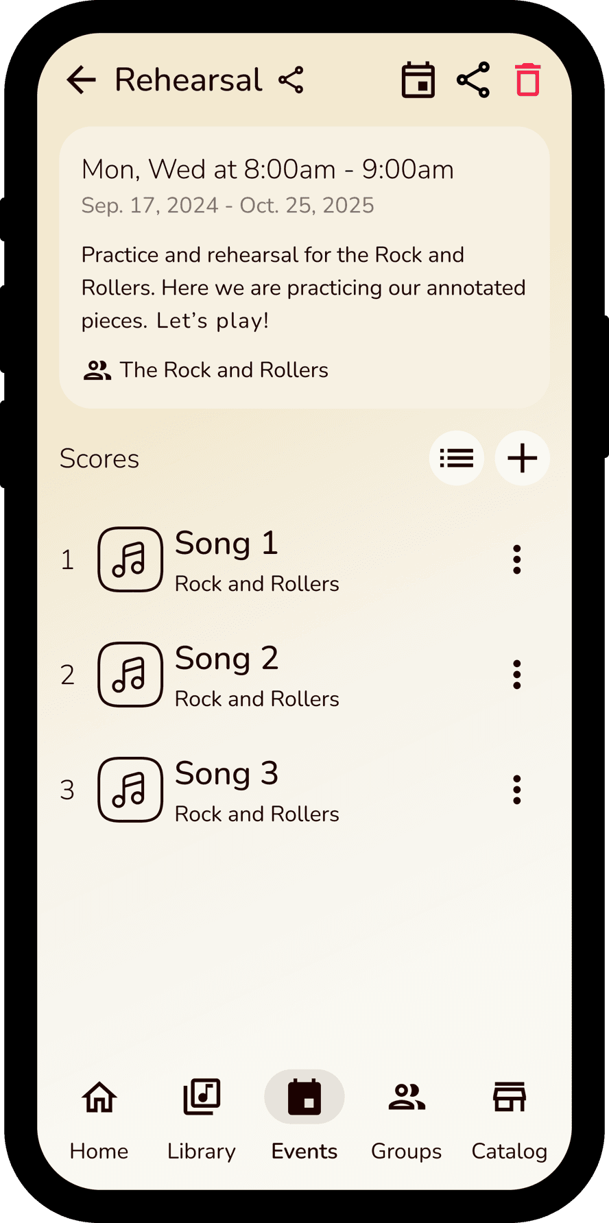
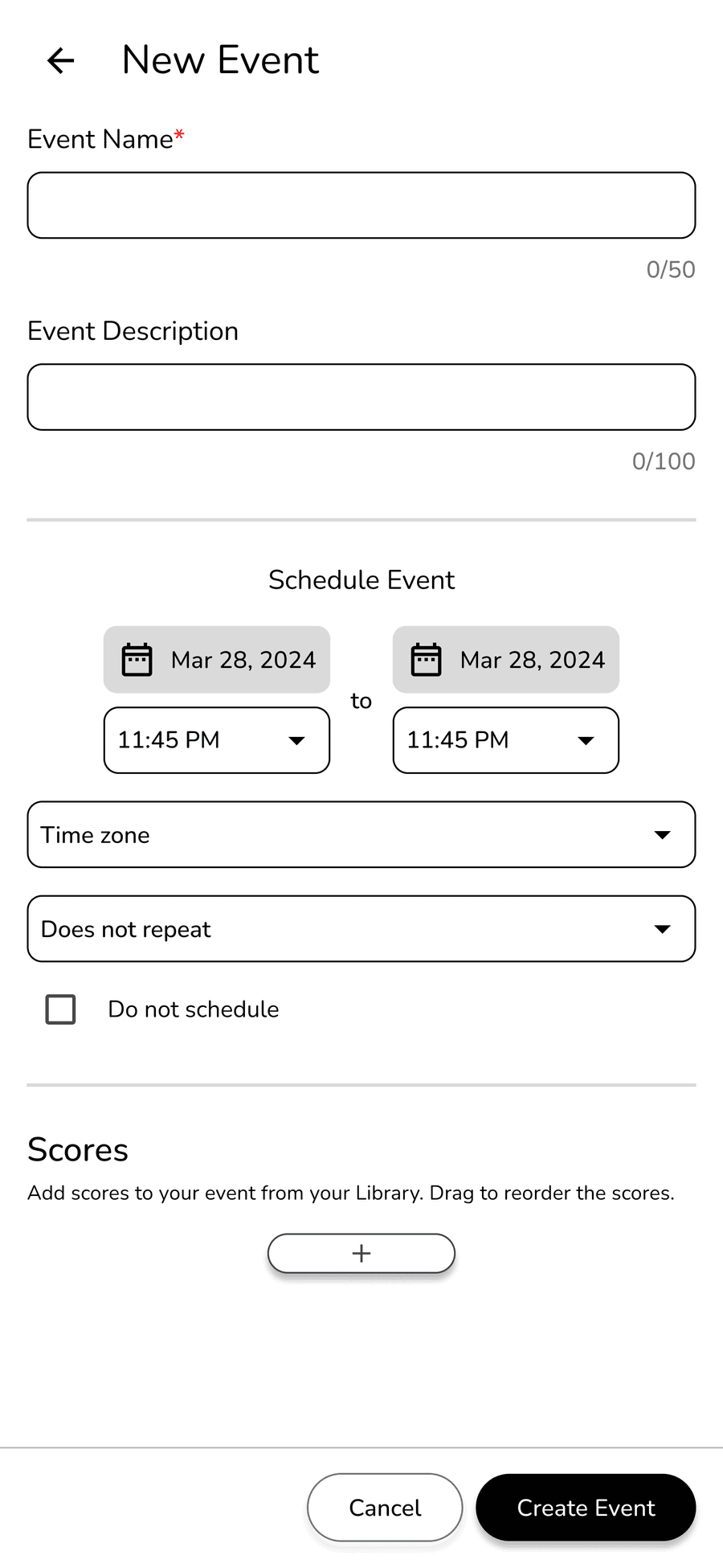
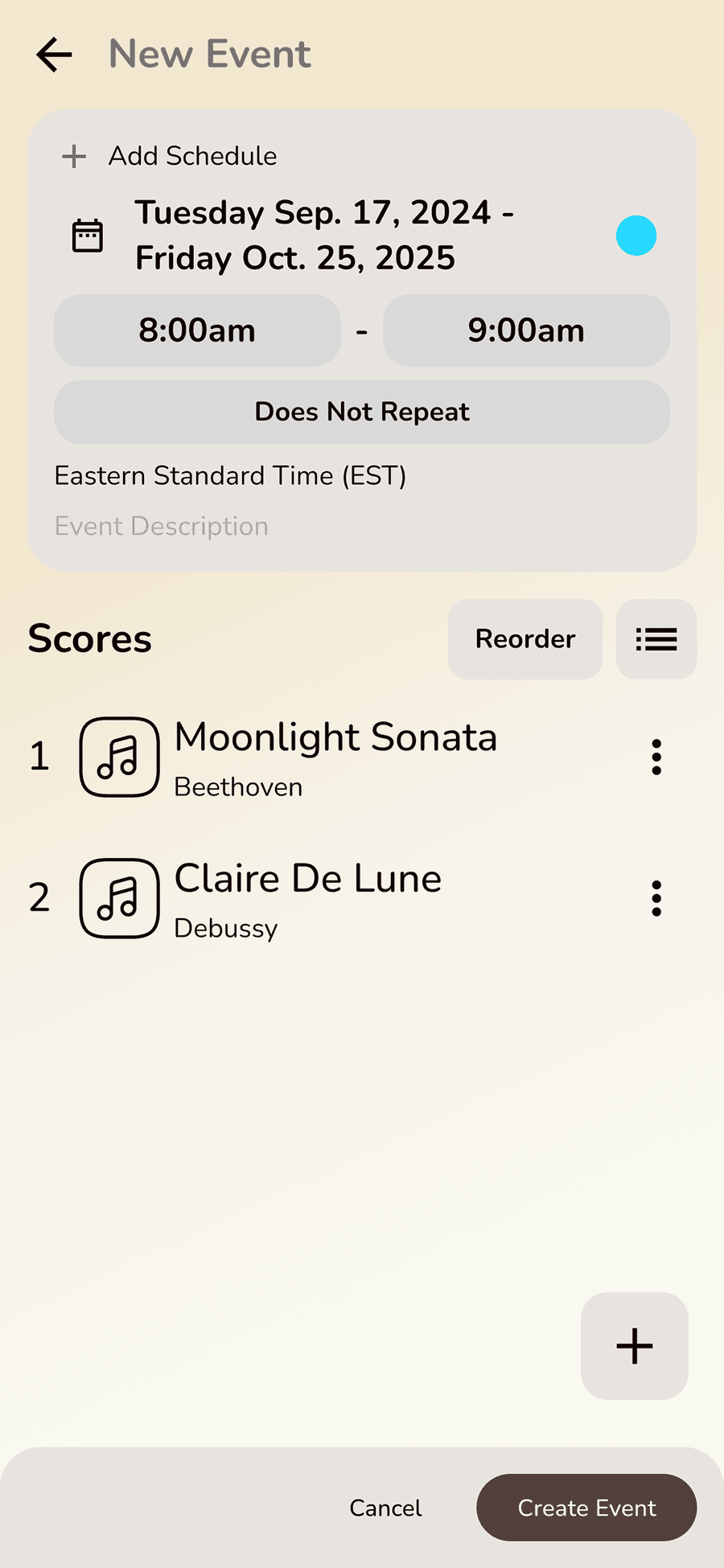
Feedback was central to the improvement and eventual finalization of the design. Take the Events page: at first, functionality was the primary goal, asking users to input all required metadata before adding scores — but it looked clunky and was hard to use. We iterated toward a cleaner aesthetic with complex functionality tucked away, then refined it once more to simplify the flow and strip out anything visually obtrusive.
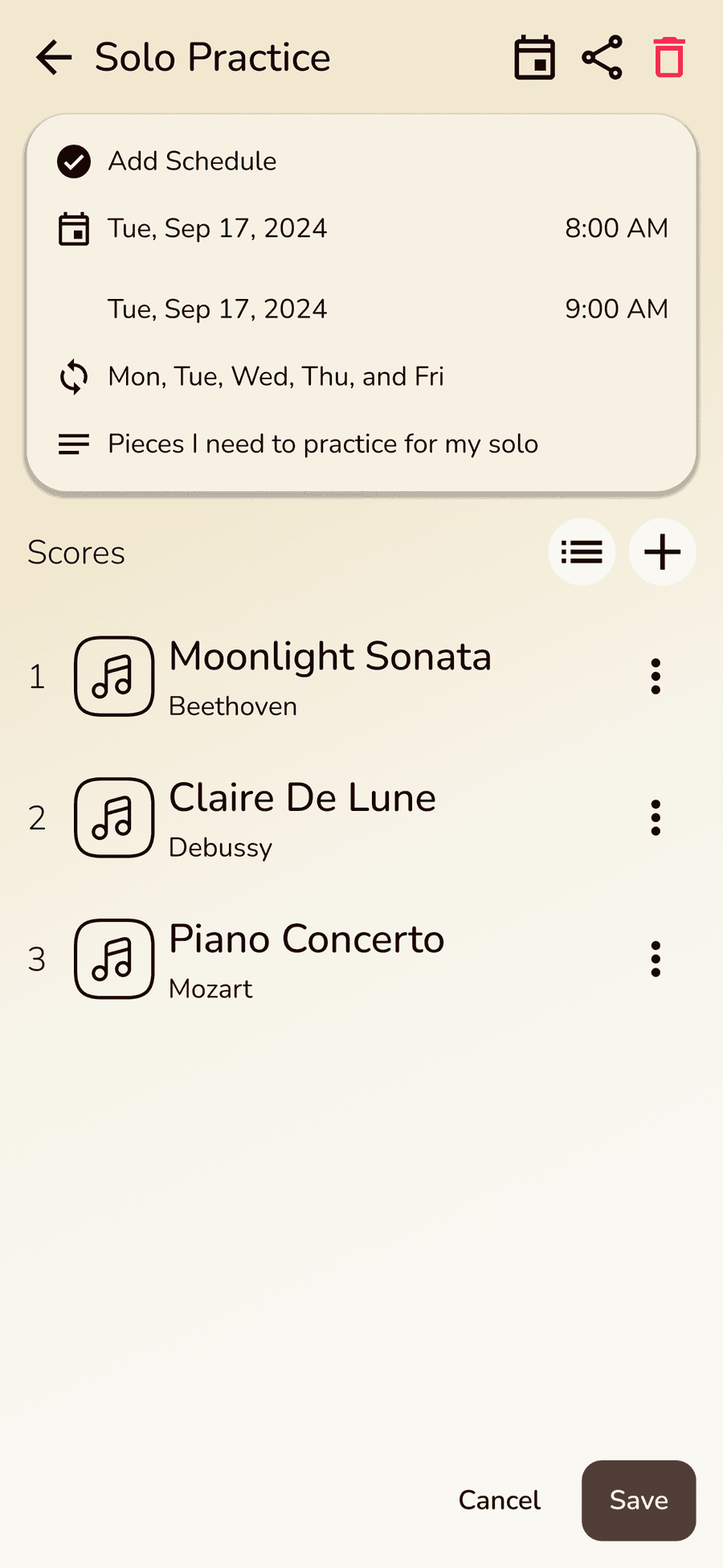
Final Designs
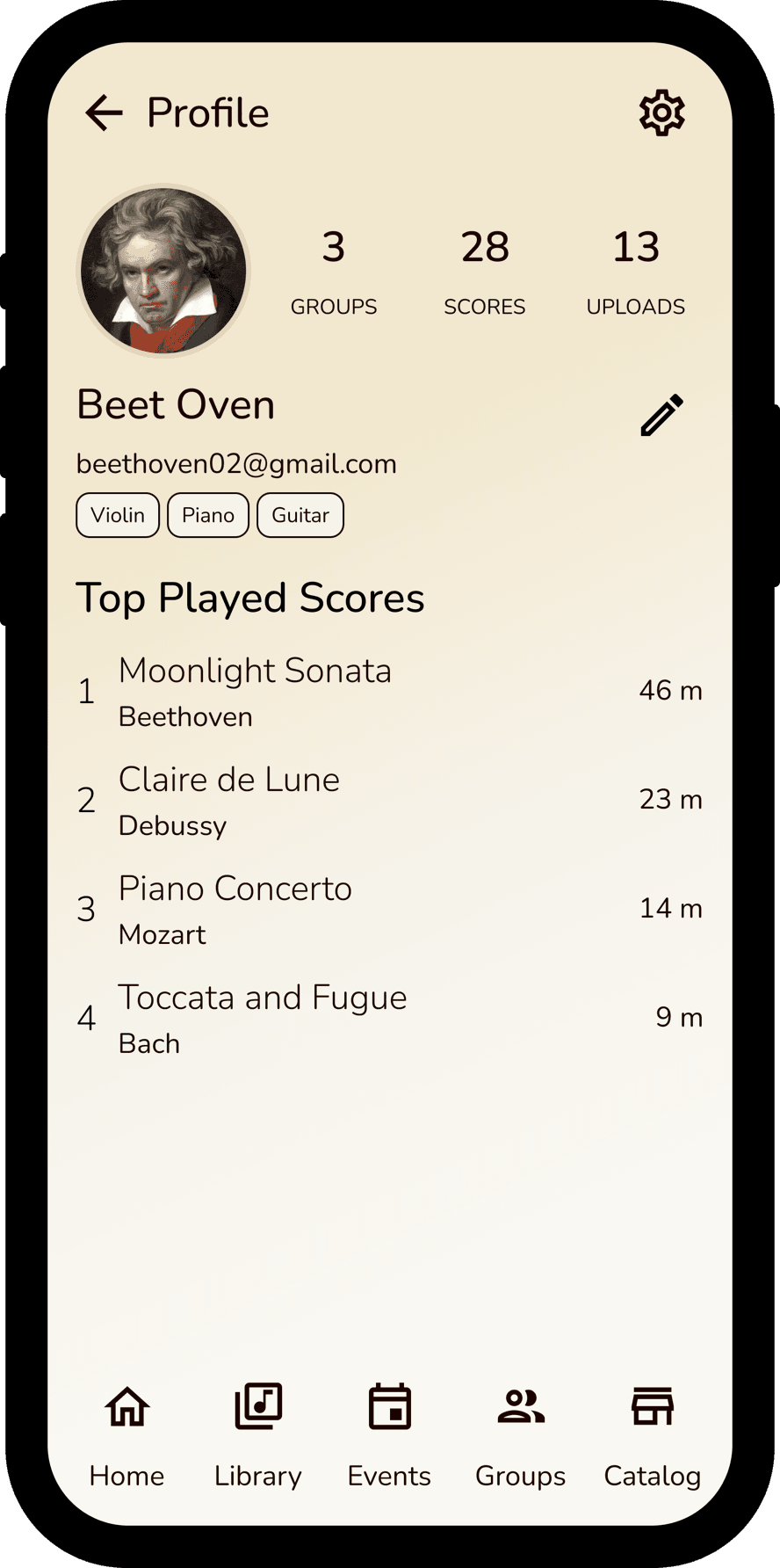
The final showcase demonstrates a visually appealing design that’s very musician-focused, with an emphasis on organization, a consistent design system, and a professional look — successfully satisfying the pain points and improving on the paper-based experience for a digital format.
“We took this project from 0 to 1 — from concept to certification on the App Store and Play Store.”
Reflection
This project was an enormous feat of hard work and dedication over the last two years. The case study above offers but a glimpse of all the hours my team and I put in to make this project come to fruition. I’m incredibly grateful for Musync, especially to Ismail Husain and Javed Husain, for giving me the opportunity to put on so many different hats and grow as a working professional — from learning about the full design-development pipeline to managing a development team to certifying the app on the App Store and Play Store, we took this project from 0 to 1.
Thank you so much for reading this case study and taking the time to go through my work.